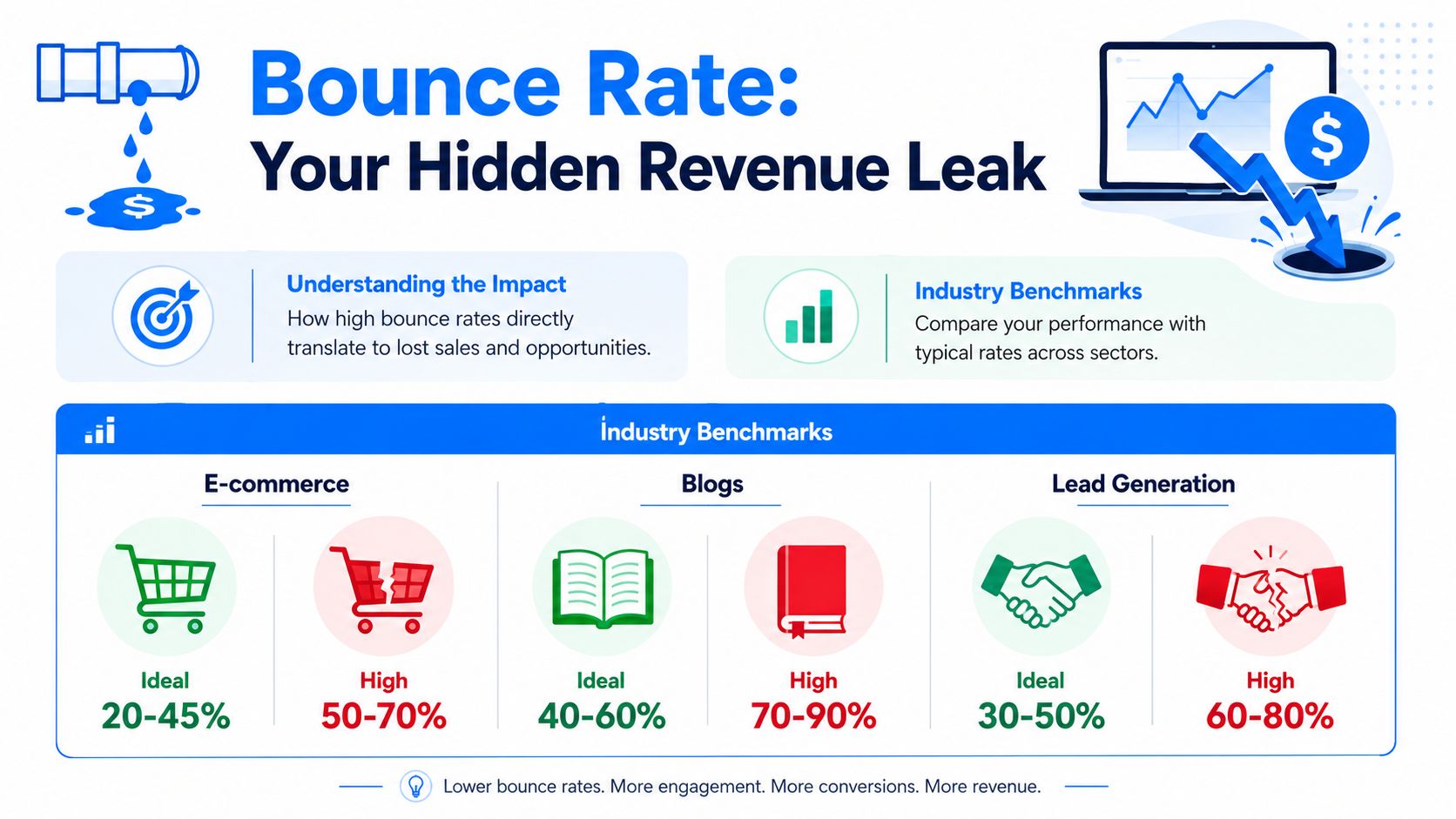
Across industries, the average bounce rate sits at about 47%, so roughly 1 in 2 visitors leaves after viewing only one page, while 40% or lower is commonly treated as good and 55% or higher as high according to Growth Mentor's bounce rate glossary. For a Shopify store, that's not a reporting quirk. It's a leak in the buying journey.
Most bounce rate reduction work fails because store owners start with surface fixes. They change a button color, add a pop-up, rewrite a headline, and hope the number drops. The better approach is more disciplined. Diagnose first. Then fix the issues in the order that usually has the biggest impact: technical friction, mobile usability, message match, page structure, and only then advanced engagement tactics.
Table of Contents
- Why Bounce Rate Is a Critical Ecommerce KPI
- The Diagnostic Phase Pinpointing Your Bounce Rate Culprits
- Foundational Fixes for Page Speed and Mobile Experience
- Aligning Content and Design to Meet User Intent
- Boosting Interaction with Smart CTAs and Gamified Pop-ups
- Measuring Success and Creating a Culture of Testing
Why Bounce Rate Is a Critical Ecommerce KPI
Bounce rate matters because it shows whether a landing page earns a second click. On a Shopify store, that second click is often the difference between a visitor who starts evaluating your offer and one who leaves before price, shipping, reviews, or product fit even enter the picture.
A high bounce rate is rarely an isolated metric problem. It usually points to wasted acquisition spend, weak first impressions, and preventable friction near the top of the session. If paid traffic lands and exits, you lose more than a visit. You lose the chance to recover CAC on that click.
Bounce rate is an early warning metric for revenue leaks
In ecommerce, bounce rate works best as an early warning KPI. It tells you whether the page did its first job. Confirm the click, build enough trust to continue, and make the next action feel obvious.
That makes it useful well beyond analytics reporting. I use bounce rate to prioritize CRO work because it helps separate pages with conversion upside from pages that are failing before persuasion even starts. If a high-intent landing page bounces heavily, fixing product copy or checkout later in the funnel will not recover much of that loss.
It also helps expose trade-offs. A page can reduce bounce by pushing more clicks to the next page, but still hurt revenue if those clicks come from weak intent or confusing navigation. The goal is not lower bounce at any cost. The goal is more qualified engagement from the traffic you already paid for.
What bounce rate usually signals on a Shopify store
On Shopify stores, expensive bounces tend to cluster on pages that should pull shoppers deeper into the journey. The pattern matters more than the sitewide average.
- Product pages: Shoppers do not get enough clarity on the product, delivery, returns, or credibility to keep evaluating.
- Collection pages: The assortment feels hard to scan, filters are weak, or the page does not match the search term or ad promise.
- Homepage traffic: New visitors cannot tell what the brand sells, who it serves, or where to click first.
- Campaign landing pages: The offer or message does not line up with the ad, email, influencer mention, or social post that drove the visit.
This is also where overlooked issues show up fast. Accessibility problems, for example, can increase abandonment before a visitor ever interacts with your merchandising. Running an accessibility test online is a practical way to catch barriers that hinder engagement.
Store owners often ask whether bounce rate should be treated as a traffic problem or a page problem. In practice, it is usually both. That is why the right playbook starts with diagnosis, then fixes the biggest friction points in order. Technical performance first. Message match and layout next. Engagement tactics after the fundamentals are doing their job.
If you need more context from actual shoppers, collect it directly. Post-purchase surveys, on-site prompts, and brief exit questions often reveal friction that analytics alone cannot explain. A structured process for getting customer feedback on your ecommerce site helps validate whether the issue is trust, clarity, usability, or offer fit.
A lower bounce rate will not solve every conversion problem. It does tell you whether visitors are getting past the first hurdle, and that makes it one of the fastest ways to spot where revenue is leaking.
The Diagnostic Phase Pinpointing Your Bounce Rate Culprits
Most stores don't have a bounce rate problem. They have three or four specific bounce rate problems hiding inside one average. Until you isolate them, every fix is guesswork.

Start with segments, not site averages
Open GA4 and stop looking at the site-wide number first. Break bounce rate down by page type, traffic source, device category, and landing page. You need to know where exits cluster.
A practical first pass looks like this:
- Landing pages first: Sort by entrances and bounce rate. High-traffic pages with high bounce deserve attention before low-traffic pages.
- Channel split: Compare organic, paid social, email, direct, and referral traffic. If one source bounces heavily, the issue may be message mismatch rather than page design.
- Device split: Look at mobile separately. A page that feels acceptable on desktop can be frustrating on a phone.
- Page template review: Group together product pages, collection pages, blog posts, and campaign landing pages. Patterns often show up at the template level.
If you run acquisition campaigns, compare ad copy and creative with the landing page above the fold. A lot of bounce rate reduction work comes down to this simple question: did the page deliver what the click implied?
Use recordings to uncover the why
Analytics tells you where people leave. Session recordings, heatmaps, and on-site feedback help explain why. Watch enough real sessions and the pattern becomes obvious. People rage-click dead elements. They stall on variant selectors. They scroll for shipping information and never find it. They close the page when a mobile pop-up hides the content.
Nielsen Norman Group's documented case study is useful here because it proves how much page-level design can matter. One site, Return A, reduced bounce rate from 30% to 2.5% after a simple redesign, and the core lessons were to test with representative users and expose obvious next steps, as shown in Nielsen Norman Group's article on reducing bounce rates.
Watch sessions from visitors who bounced on your top landing pages. Don't ask whether the page looks good. Ask where momentum stops.
A few practical diagnostics are easy to miss:
- Broken trust cues: Missing delivery details, unclear returns policy, weak product imagery, or hidden reviews.
- Accessibility friction: Low contrast, poor keyboard flow, unlabeled controls, or modals that trap focus. Running an accessibility test online can uncover issues that cause users to leave.
- Feedback gaps: If customers keep landing and leaving, collect direct input through short surveys or email follow-ups. This guide on how to get customer feedback for your ecommerce site is useful when analytics alone isn't telling the full story.
Build a culprit list before you make changes
Don't jump from diagnosis straight into redesign. Rank issues by likely impact and effort. In most stores, the best sequence is:
- Fix blockers first: Slow loads, broken mobile layouts, intrusive overlays, dead links.
- Fix intent mismatch next: Rewrite headlines, clean up hero sections, align ad and page copy.
- Fix path clarity after that: Improve CTAs, internal links, related products, and navigation cues.
That order keeps teams from polishing a page that still has structural friction.
Foundational Fixes for Page Speed and Mobile Experience
If the store is slow or awkward on mobile, nothing layered on top will save it. Copy won't rescue it. Reviews won't rescue it. Discounts won't rescue it. Bounce rate reduction starts with the basics because every other tactic depends on the visitor staying long enough to see them.
Fix speed before you touch persuasion
The technical sequence is well established. Industry guidance summarized by Semrush's bounce rate guide converges on the same order: make the page load fast, make the purpose obvious within the first screen, and give visitors a clear action path. The same guidance also warns that unexpected popups, cluttered navigation, or mismatched ad-to-landing-page messaging often increase immediate exits.
That means your first pass should be operational, not creative.
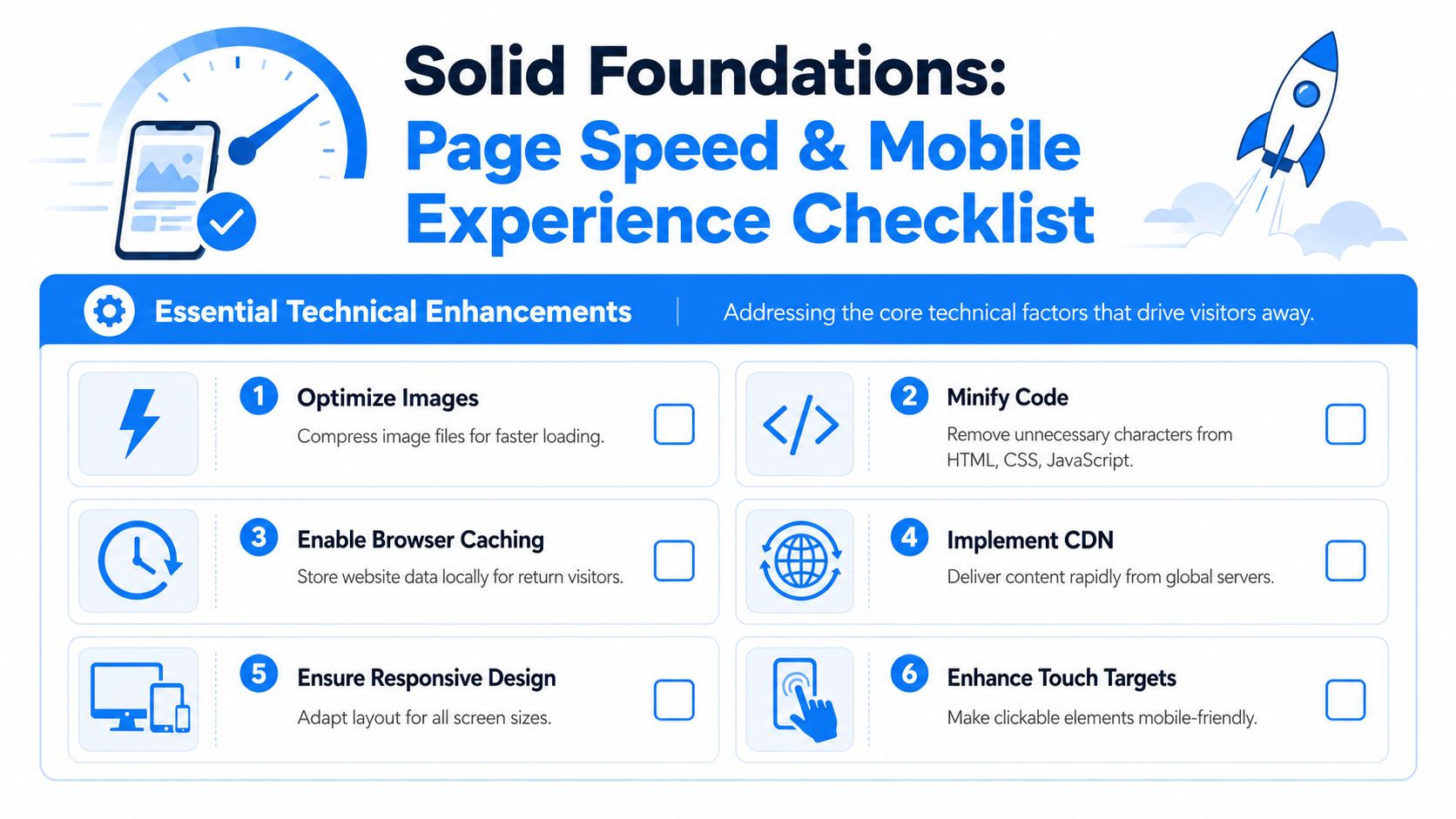
Use this checklist on your highest-bounce landing pages:
- Compress images: Product photos and banners often carry most of the page weight. Resize and compress them before upload.
- Minify CSS and JavaScript: Remove code bloat that delays rendering.
- Enable caching: Returning visitors shouldn't reload the same assets from scratch.
- Trim apps and scripts: Shopify stores often slow down because too many app scripts fire at once.
- Review hosting and infrastructure choices: If performance is inconsistent, it helps to understand how to choose web hosting for better performance, especially when third-party tools and traffic spikes are involved.
A common mistake is optimizing only the homepage. For most stores, bounce problems sit on the pages people land on from campaigns and search. Product pages, collection pages, and seasonal landing pages deserve the first round of speed work.
Fast pages don't just feel better. They preserve intent. Every delay gives the shopper a chance to reconsider, get distracted, or leave.
Treat mobile as a separate buying environment
Mobile-first doesn't mean shrinking the desktop design until it fits. It means accepting that mobile shoppers scan differently, tap differently, and abandon faster when the path feels cramped or confusing.
The practical review is simple. Open your top landing pages on a real phone and try to complete the next step with one thumb. If the experience feels annoying, your customers feel it too.
Focus on these points:
- Touch targets: Buttons, variant selectors, accordions, and quantity controls need enough space to tap accurately.
- Above-the-fold clarity: Product name, value proposition, price context, and primary CTA should be obvious without hunting.
- Visual hierarchy: Don't let badges, announcement bars, sticky elements, and chat widgets crowd the first screen.
- Readable copy: Dense product descriptions and tiny tabs push users away.
- Checkout continuity: The move from product page to cart should feel stable and predictable.
If you want a practical reference for reviewing layouts and usability patterns, this piece on mobile user experience is a helpful checkpoint.
What usually doesn't work
Teams often try to lower bounce by adding more. More badges, more urgency text, more pop-ups, more menu links, more sliders. On underperforming pages, that usually adds friction instead of reducing it.
A better rule is subtraction first. Remove anything that delays comprehension or competes with the main action. On ecommerce pages, the fastest wins often come from making the page lighter, clearer, and easier to operate with minimal thought.
Aligning Content and Design to Meet User Intent
A click is a promise. The shopper saw something in a search result, ad, email, influencer post, or social caption and formed an expectation before the page even loaded. If the first screen doesn't confirm that expectation quickly, the session is fragile.
Confirm the click immediately
The best ecommerce pages answer three questions at a glance: what is this, who is it for, and what should I do next? If your hero section can't do that, bounce risk rises even when the product itself is strong.
That's why headline clarity matters more than cleverness. A paid ad that promises a specific product benefit shouldn't land on a vague collection page with lifestyle imagery and generic brand language. Likewise, a shopper clicking into “waterproof dog seat covers” should not need to scroll to confirm they're in the right place.
Use a simple scent check on important pages:
- Headline match: Does the headline echo the language or intent behind the click?
- Visual match: Do the images confirm the product, audience, or use case immediately?
- Offer match: If the ad highlighted a bundle, discount, or feature, is it visible right away?
- Path match: Is the primary next action the same one the visitor expected to take?
When stores miss on any of those, bounce isn't random. It's a rational response.
Build confidence before you ask for action
Some pages ask for commitment before they've earned trust. They push hard on “Add to Cart” while leaving basic objections unresolved. Shoppers want signals that the store is legitimate, the product is clear, and the buying experience won't create problems later.
The confidence layer usually includes:
- Useful product imagery: Not just attractive photos, but images that answer practical questions.
- Scannable copy: Short paragraphs, bullets, and bolding that let shoppers skim for what matters.
- Support details: Shipping, returns, sizing, ingredients, materials, compatibility, or care instructions where relevant.
- Trust cues: Reviews, guarantees, secure checkout indicators, and transparent policies.
If a shopper has to hunt for the information needed to feel safe buying, many of them won't hunt. They'll leave.
Design supports this just as much as copy. Strong pages guide the eye. Weak pages force the visitor to interpret the layout. When I audit stores with high bounce on collection and product pages, a common pattern is visual indecision. Too many competing elements. No clear focal point. Important content buried in tabs or lower modules. The page isn't broken, but it doesn't create momentum.
For bounce rate reduction, momentum matters more than decoration. Your page should reassure, orient, and direct. If it does those three things quickly, visitors are far more likely to continue the journey.
Boosting Interaction with Smart CTAs and Gamified Pop-ups
A large share of ecommerce visitors leave without taking a second step. On many Shopify stores, the problem at this stage is not traffic quality or page speed. It is hesitation that goes unanswered.
A shopper lands on a product page from Instagram. The product fits. The page has already done the basic job of loading fast and presenting the offer clearly. Then the visitor pauses, scrolls, and starts looking for a reason to leave or a reason to continue. That decision point deserves more attention than many stores give it.
The next step has to feel obvious
Before adding any overlay, tighten the CTA path on the page itself. If the primary action is weak, a popup becomes a bandage for a page-level problem.
The strongest CTA improvements are usually straightforward:
- Placement: Put the main action near the point of decision, not buried after long blocks of content.
- Copy: Use action text that matches intent, such as “Add to Cart,” “Choose Your Size,” or “See Bundle Options.”
- Contrast: Make the button easy to spot without making it look like it belongs to a different site.
- Support: Add one short line near the CTA if shoppers commonly hesitate over shipping, returns, delivery timing, or stock status.
Interface design changes bounce behavior by reducing uncertainty. In practice, I see this often on product pages with too many competing actions. The fix is rarely dramatic. Remove weaker secondary buttons, tighten the copy around the main action, and place reassurance close to the click. That usually lifts interaction faster than adding another widget.
Use pop-ups to rescue intent, not interrupt it
Pop-ups work best after the fundamentals are in place. They should respond to hesitation, not create it.
Generic newsletter overlays still underperform because they ignore context. A visitor browsing a product page, a collection page, and a cart page is not in the same mindset. The offer, timing, and format should change with the page type and the visitor signal.
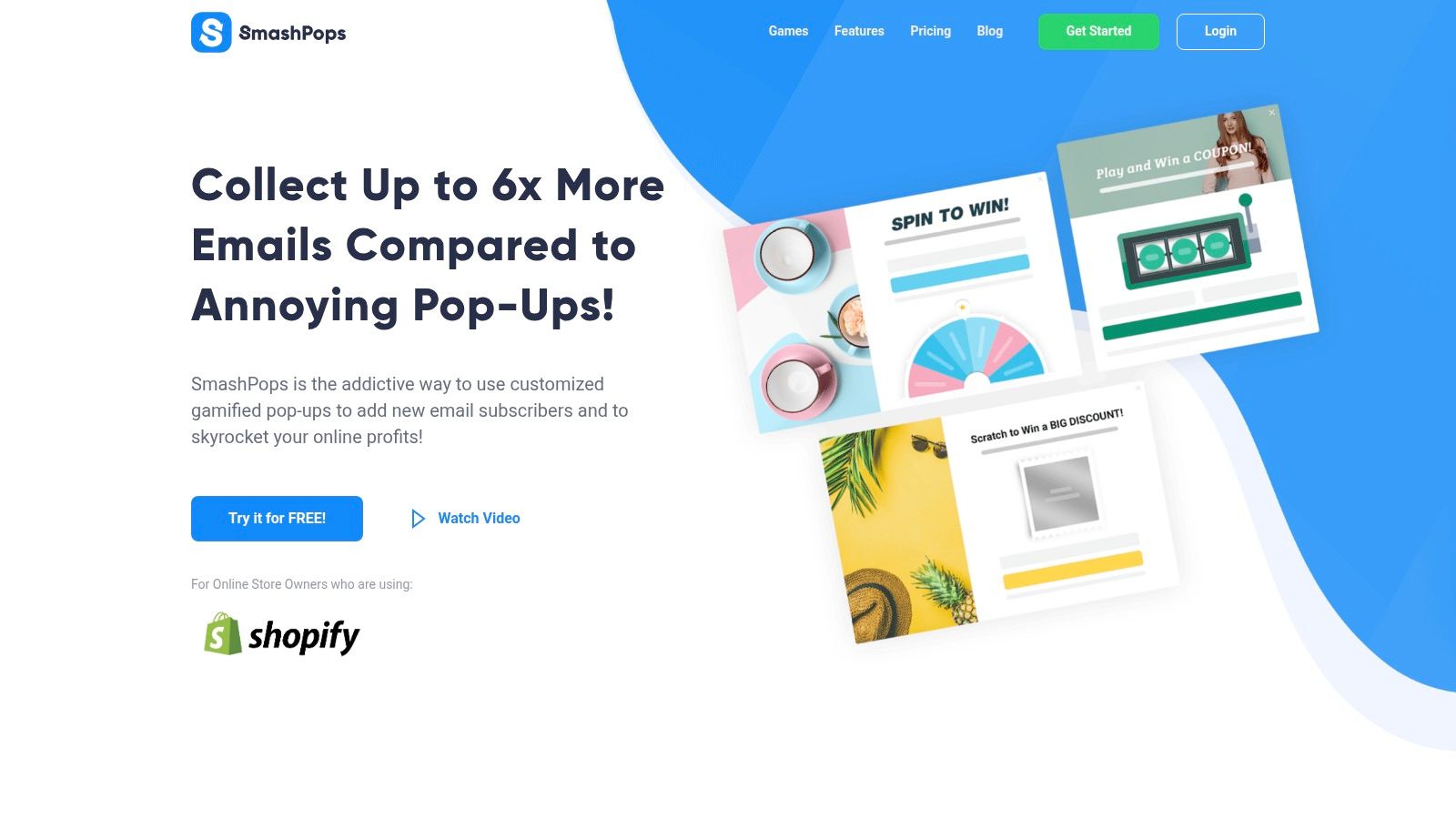
That is why interactive content formats for ecommerce lead capture and retention can help. Tools like SmashPops use formats such as Spin the Wheel, Scratch Card, or Pick a Gift, along with targeting rules like exit intent, scroll depth, device type, referrer, and country. On Shopify, that gives merchants a practical way to turn a likely exit into a value exchange, but only if the incentive fits the moment.
A short demo helps show the format in action:
The trade-off is simple. More aggressive triggers increase popup impressions, but they also increase annoyance. Higher display volume does not mean better outcomes. Stores usually get better results by limiting overlays to high-friction moments and matching the message to the page.
Use rules like these:
- On product pages: Trigger later and tie the offer to purchase hesitation, such as first-order discounts, bundles, or shipping reassurance.
- On collection pages: Give shoppers a reason to keep browsing, such as a category quiz, a personalized offer, or a curated promotion.
- On returning visits: Reference repeat behavior or known category interest when possible.
- On mobile: Keep the interaction short, easy to close, and sized correctly for the screen.
A popup should resolve hesitation. If it appears during normal exploration, it adds friction and pushes the visitor out faster.
Used in the right order, smart CTAs do the primary conversion work and gamified pop-ups recover a portion of visitors who were about to leave. That sequence matters. Diagnose first, fix the page path second, then layer in advanced engagement only where it supports the buying journey.
Measuring Success and Creating a Culture of Testing
Bounce rate reduction isn't a one-time cleanup. It's an operating habit. Stores improve faster when they stop asking “Did we redesign the page?” and start asking “What changed, for which visitors, and what happened next?”
Track the change, not just the metric
Every meaningful site update should be documented. If you changed a hero section, compressed media, removed an intrusive overlay, or rewrote product-page copy, note the date and the affected pages inside your analytics workflow or reporting sheet.
Then compare results at the page and segment level, not just site-wide. A lower bounce rate on one landing page means more if add-to-cart activity, session depth, or conversion behavior also improved. A lower bounce rate with worse downstream performance can mean you encouraged extra clicks without improving buying intent.
Use A/B testing for changes that affect behavior directly, such as:
- CTA experiments: Placement, wording, button treatment, or sticky bars.
- Headline tests: Promise clarity, offer framing, or audience-specific messaging.
- Layout changes: Media order, review placement, shipping information, or trust modules.
- Engagement tools: Different popup timing, offer structure, or game template selection.
Measure bounce rate alongside downstream KPIs
Don't let bounce rate become the only scoreboard. A healthy store looks at engagement and revenue signals together.
| Metric | What It Measures | Goal Direction |
|---|---|---|
| Bounce rate | Single-page sessions from entry pages | Down |
| Conversion rate | Visits that turn into purchases or defined goals | Up |
| Average session duration | How long visitors stay engaged | Up |
| Pages per session | Depth of browsing activity | Up |
This table keeps teams honest. If bounce rate drops but conversion rate stalls, the change may have created curiosity rather than purchase momentum. If pages per session rise but revenue quality falls, visitors may be wandering instead of progressing.
The strongest optimization cultures keep testing small, learning fast, and carrying forward only what improves the full journey. That's how bounce rate reduction becomes durable instead of cosmetic.
If you want to turn more abandoning visitors into email subscribers and buyers, SmashPops is worth a look. It gives Shopify stores a way to use interactive pop-ups with targeting rules like exit intent and scroll depth, which can help recover sessions that would otherwise end with a bounce.