The most popular advice on Shopify accessibility is also the most dangerous: install an app, turn on a widget, and assume you're covered.
That approach creates a false sense of safety. A visible toolbar can help some visitors, but it doesn't automatically fix the product cards, forms, menus, popups, and app-injected code that shape the actual shopping experience. If the underlying store is still hard to use with a keyboard or screen reader, the widget becomes compliance theater.
Store owners need a more honest standard. A Shopify accessibility app can be useful, but only when it's treated as one part of a broader accessibility process that includes theme review, content cleanup, app vetting, and ongoing testing.
Table of Contents
- Why Most Accessibility Efforts Fail and What to Do
- Accessibility Beyond Compliance The Business Case
- Overlay Widgets vs Code Level Fixes
- Evaluating an App What to Look For and Avoid
- How to Add an Accessibility App to Your Shopify Store
- Measuring the Impact of Improved Accessibility
- Building a More Inclusive and Profitable Store
Why Most Accessibility Efforts Fail and What to Do
Most accessibility efforts fail because merchants buy a tool before they define the problem.
The web's baseline is already poor. In the WebAIM Million 2025 summary for Shopify accessibility statistics, 94.8% of the top one million home pages had detectable WCAG 2 failures, compared with 95.9% in 2024. The same summary reports an average of 51 distinct accessibility errors per page, with 81% of pages showing low-contrast text, 54.5% missing alt text, and 48.6% missing form labels.
Those aren't edge cases. Those are the same failure types that show up constantly in Shopify stores: unreadable announcement bars, product images without useful alt text, filters that don't announce clearly, and forms that look polished but confuse assistive technology.
Why app installs disappoint
A merchant installs a Shopify accessibility app expecting a one-click fix. The app adds a toolbar. The site now has text resizing, contrast controls, maybe text-to-speech. That can help some users, but it doesn't rewrite weak markup in the theme or repair broken interactions created by other apps.
If a product quick view traps focus, a review widget has unlabeled controls, or the cart drawer can't be operated cleanly by keyboard, the store still has core usability problems. The app may improve the surface while the code underneath remains fragile.
Practical rule: If a tool promises compliance without requiring you to review theme code, app behavior, image alt text, and form structure, it's promising too much.
What merchants should do instead
Start with the store's highest-risk journeys:
- Homepage navigation: Check menus, featured collections, banners, and search.
- Product pages: Review image galleries, variant selectors, size guides, reviews, and add-to-cart flows.
- Cart and checkout handoff: Test drawers, discount fields, shipping estimators, and error states.
- Lead capture and support tools: Audit popups, chat widgets, and sticky bars.
Then align fixes with the actual standard. If you need a practical refresher on the framework behind these decisions, Wise Web's guide to understanding accessibility standards is a solid reference point for merchants and agencies.
The goal isn't to make your store look accessible. The goal is to make it usable.
Accessibility Beyond Compliance The Business Case
Accessibility matters because Shopify is massive, and risk scales with that footprint. One independent 2026 industry guide estimated 4.6+ million active Shopify stores globally, while also noting that accessibility lawsuits are rising alongside that scale. The same source makes an important point for merchants: custom themes, app integrations, and store content remain the merchant's responsibility even when Shopify itself includes some accessibility features, as outlined in this Shopify accessibility checklist for ADA compliance.
That changes the business discussion. Accessibility isn't just a legal checkbox attached to the platform. It's operational responsibility attached to your storefront.
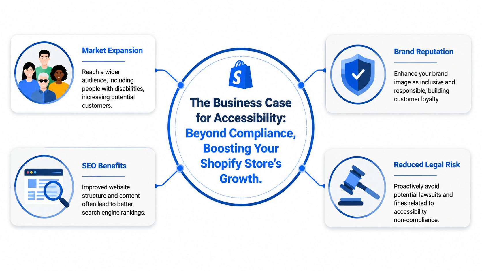
Legal exposure is only one part of it
Merchants often start thinking about accessibility after hearing about demand letters. That's understandable, but it leads to a narrow strategy. If legal risk is the only lens, store owners look for the cheapest visible fix.
A better lens is operational resilience. An accessible store is less likely to break when you add new content, redesign templates, or install more marketing tools. The same work that improves accessibility often improves consistency in navigation, form handling, mobile interactions, and content structure.
The business case shows up in day-to-day store performance
Accessibility work tends to clean up friction that hurts everyone, not just users with disabilities.
Consider what usually gets fixed during a real accessibility pass:
| Store element | Accessibility improvement | Broader business effect |
|---|---|---|
| Product images | Better alt text and clearer labels | Cleaner product context and fewer ambiguous visuals |
| Navigation | Keyboard-friendly menus and logical focus order | Easier browsing on desktop and mobile |
| Forms | Proper labels and clearer errors | Smoother email capture, account creation, and cart actions |
| Buttons and targets | More forgiving tap areas | Better mobile usability |
That overlap matters. Merchants who already watch margins know that small usability failures add up across sessions, especially on mobile. Tools like a Shopify profit margin calculator help frame how operational improvements affect the economics of a store, and accessibility belongs in that same conversation because friction erodes conversion.
Brand trust is part of the return
Customers notice when a site feels considerate. They also notice when it feels hostile. Tiny failures, such as an unreadable popup close button or a filter that can't be operated without a mouse, signal that the store was built for only one kind of shopper.
A merchant doesn't need a perfect store on day one. They need a store that removes obvious barriers instead of adding new ones every month.
The strongest accessibility programs treat inclusion as a practical business discipline. They lower avoidable risk, reduce friction in key flows, and make the brand easier to trust.
Overlay Widgets vs Code Level Fixes
When merchants compare Shopify accessibility app options, they usually run into two very different products that are marketed almost the same way.
One is a front-end overlay widget. The other is code-level remediation. If you don't separate those two ideas, it's easy to buy the wrong thing.
What an overlay widget actually does
A widget sits on top of the storefront and gives visitors controls. That may include larger text, contrast adjustments, reading aids, or keyboard-navigation shortcuts. Those features can be helpful, especially for shoppers who want quick personalization without changing their device settings.
It's comparable to painting over a crack in a wall. The room may look better, and some surface issues may feel less severe, but the structure underneath hasn't changed.
A popup with a hidden close button is still a popup with a hidden close button. A variant selector with weak semantics is still weak. A screen reader won't magically understand unclear markup because a toolbar icon appeared in the corner.
What code-level remediation does differently
Code-level work changes the actual storefront output. It fixes the theme, template logic, interactive components, and content patterns that create barriers in the first place.
That looks more like foundation repair:
- Navigation gets rebuilt so focus order makes sense.
- Forms get labeled properly so screen readers announce them clearly.
- Buttons and icons get accessible names so users know what actions do.
- Modals and drawers get focus handling so shoppers can open and close them without getting trapped.
- Touch targets get reviewed so mobile interactions are less error-prone.
This is also where app conflicts show up. A merchant may assume a popup tool is harmless because it boosts signups. In practice, popups often add modal behavior, layered buttons, timers, and focus changes. If you run promotional overlays, discount wheels, or email capture tools, it helps to understand the interaction risks behind a typical Shopify popup app setup.
Working rule: Use widgets for user controls. Use code changes for accessibility defects. Don't confuse one job with the other.
The right model for most stores
For many stores, the practical answer isn't "widget or code." It's "widget plus code, with code doing the heavy lifting."
If the app improves operability for some shoppers, keep that value. But judge it by a stricter question: does the store still work well when the widget is ignored, disabled, or never opened? If the answer is no, you don't have an accessibility solution yet.
Evaluating an App What to Look For and Avoid
Most app listings sound reassuring. They mention ADA, WCAG, AI fixes, scans, toolbars, and compliance. The problem is that the language is often broader than the product.
A good Shopify accessibility app should help you identify issues, improve operability, and support real remediation. A weak one mainly gives you a floating badge and a sales promise.
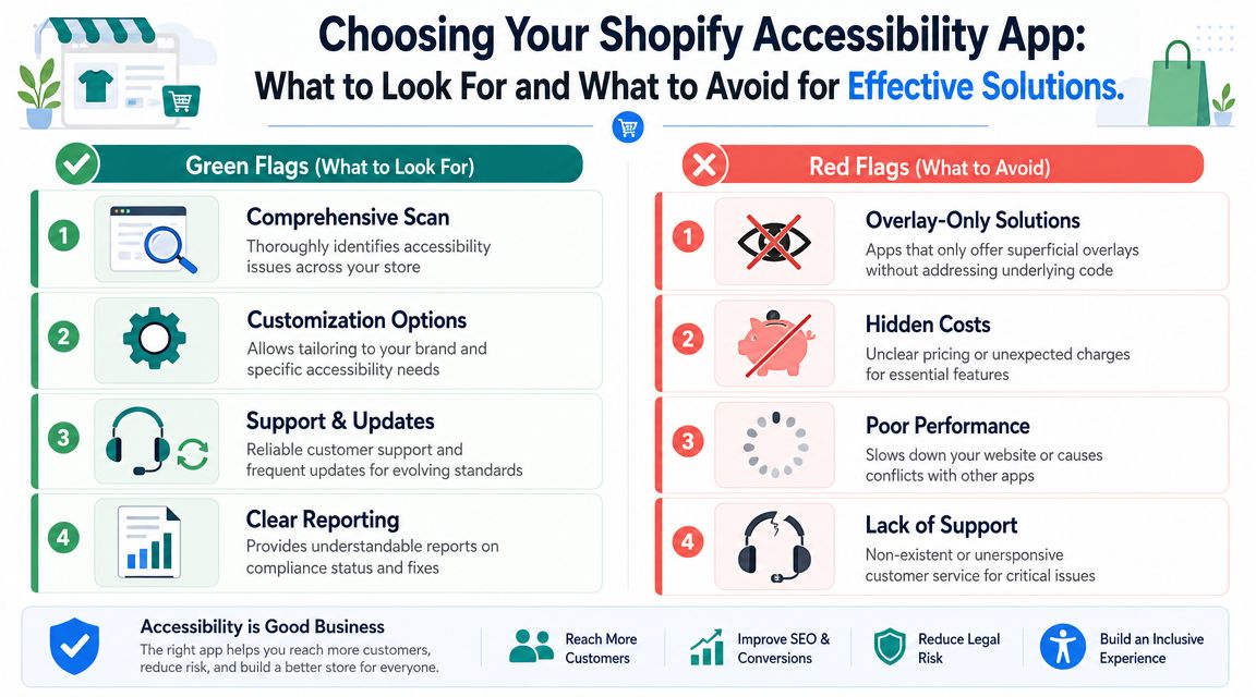
Green flags worth paying for
Some apps earn their place in the stack. They tend to share a few practical traits.
- Meaningful scan reports: The app should tell you what issue exists, where it appears, and what type of fix is needed. "Accessibility score improved" isn't enough.
- Support for real remediation: The best tools don't stop at detection. They guide code changes, content cleanup, or developer handoff.
- Keyboard and screen-reader awareness: If the app improves navigation, it should do so without breaking tab order or creating extra clutter.
- Clear compatibility expectations: Good vendors are honest about what the app can influence and what still requires theme or app-level work.
Some front-end tools can also add useful controls for visitors, such as keyboard navigation, text-to-speech, contrast changes, and multilingual UI. That lines up with Shopify's own guidance that links, buttons, dropdowns, and form controls should be keyboard-operable, and that primary mobile touch targets should be large enough to tap comfortably. The key is whether those controls preserve semantic markup and don't interfere with assistive technology, as shown in the Accessibility Assistant app guidance.
Red flags that usually signal compliance theater
Independent commentary is blunt on this point. Many Shopify accessibility apps are still marketed as compliance tools even though overlays do not repair underlying HTML, CSS, or JavaScript, and assistive-tech users often disable them. One cited figure says 67% of assistive technology users turn off accessibility widgets, noted in this comparison of Shopify accessibility apps and overlay limits.
That doesn't mean every widget is useless. It means a widget alone is a weak answer.
Watch for these warning signs:
| Red flag | Why it matters |
|---|---|
| Claims of instant compliance | Accessibility isn't instant when themes, apps, and content are all in play |
| No mention of code-level issues | The vendor may be avoiding the hard part |
| Vague reports | You can't fix what the app won't describe |
| Toolbar-first messaging | The visible badge may be the product's main value, not actual remediation |
Questions I would ask before installing
Ask the vendor plain questions. If the answers are slippery, move on.
- What does the app change in the code, and what does it only change on the front end?
- How does it handle keyboard navigation, focus order, and screen-reader interpretation?
- What happens when another Shopify app injects a popup, review widget, or chat layer?
- Can I see an issue report with specific remediation guidance?
If the product demo spends more time showing the toolbar icon than showing the defects it can help you address, the priorities are backwards.
A serious merchant shouldn't buy reassurance. They should buy visibility, control, and fewer barriers.
How to Add an Accessibility App to Your Shopify Store
Adding an accessibility app is easy. Adding one without creating new barriers is the part merchants underestimate.
A lot of stores install a widget, publish it, and assume the job is done. That is how compliance theater starts. Real accessibility work on Shopify affects theme code, app interactions, focus states, forms, drawers, and mobile behavior. If you skip testing, you can end up with a badge on the screen and a checkout path that is harder to use than it was before.
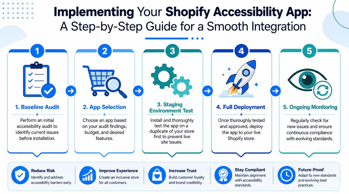
Start with a baseline before you install anything
Check the live store before the app touches it. The goal is simple. Identify where the current friction lives so you can tell whether the app improves anything or just changes the presentation.
Review the templates and features that affect revenue and support load:
- Homepage and collection pages: Menus, banners, sliders, filters, and search
- Product pages: Media gallery, variants, reviews, add-to-cart, and size guides
- Cart flows: Drawer, note field, discount area, and upsells
- Marketing layers: Popups, sticky bars, chat, and quiz tools
This step saves time later. If keyboard access breaks, focus disappears, or a modal traps users after install, you can trace the problem faster.
Install on a duplicate theme first
Never test an accessibility app on the published theme first. Duplicate the theme, install the app there, and work through the store like a customer would.
Test the interactions that usually fail first:
- Tab through the header and main navigation
- Open and close menus, drawers, and modals
- Move through product options without a mouse
- Check whether focus stays visible and follows a logical order
- Use a screen reader on your key templates
- Confirm that buttons, filters, and form fields still make sense on mobile
If the app adds a toolbar or badge, test that too. A visible widget is not proof of accessibility. It can still interrupt reading order, compete with sticky UI, or create one more obstacle on a small screen. This is also where broader mobile user experience best practices matter, because the same cramped layouts and awkward tap targets that hurt conversion often hurt accessibility at the same time.
Test the full app stack, not just the accessibility app
Accessibility defects often come from unrelated Shopify apps. Reviews, chat, subscriptions, upsells, and promotional popups are common trouble spots because they inject their own markup and scripts.
Shopify merchants have reported this kind of conflict in practice, including in this Shopify community thread about Inbox and ADA compliance issues. The lesson is practical. An accessibility app cannot guarantee a compliant experience if other apps keep adding inaccessible components on top of it.
Use a rollout checklist that reflects real store risk
A simple process works better than a rushed launch:
- Audit the current store
- Duplicate the theme
- Install and configure the app in the duplicate theme
- Test keyboard-only browsing on core templates
- Test with a screen reader on the pages that drive sales and support requests
- Check popups, chat, reviews, and promotional scripts
- Publish only after the main customer journeys work cleanly
For most stores, the journeys that matter are product discovery, variant selection, add-to-cart, cart review, and form completion. If those flows are not usable, the app is not solving the problem that matters.
Monitor after launch
Publishing is the start of maintenance, not the end of implementation. Theme edits, seasonal campaign pages, new apps, and vendor updates can all reintroduce accessibility issues.
Check the store after every meaningful change. Pay close attention to mobile drawers, sticky add-to-cart bars, popups, filters, and form validation. Those are the places merchants stop retesting, and they are often where new barriers show up first.
Test after every meaningful app install, popup change, or theme release. Accessibility failures rarely announce themselves. They appear in the interactions merchants stop checking.
Measuring the Impact of Improved Accessibility
Accessibility work should be measured like any other storefront improvement. Not with a vanity score alone, but with behavior.
A front-end accessibility app can improve operability by exposing controls such as keyboard navigation, text-to-speech, and contrast changes. That aligns with Shopify's guidance around keyboard access and mobile tap targets, including the recommendation that primary touch targets should be at least 44×44 pixels, described in the earlier app guidance section. But the main question for a merchant is whether shoppers can complete tasks with less friction.
What to monitor in practice
Look at the parts of the funnel where accessibility fixes should change behavior:
| Area | What to observe | What improvement may look like |
|---|---|---|
| Product pages | Engagement with images, variants, and add-to-cart | Fewer dead ends and smoother browsing |
| Forms | Error handling in signup, contact, or cart notes | Fewer abandoned interactions |
| Navigation | Pathing through menus and collections | More consistent movement across templates |
| Mobile interactions | Taps on buttons, drawers, filters, and close icons | Less mis-tapping and less frustration |
Don't force attribution too precisely. Accessibility improvements usually work as a bundle. Cleaner labels, better focus order, stronger contrast, and larger tap areas often improve the same session together.
Useful qualitative signals
Merchants often overlook the simplest evidence:
- Support messages change: Fewer complaints about not being able to close something, find something, or submit something.
- QA gets easier: New campaigns break less often when the base UI is more stable.
- Team confidence improves: Designers and marketers stop guessing whether a popup, banner, or app feature created a new blocker.
How I judge whether the work is paying off
I look for reduced friction in the most important journeys. Can a shopper move from homepage to product to cart without hitting a confusing interaction? Can they use the site with only a keyboard? Can they recover from form errors without hunting for what went wrong?
If you want a broader lens on how interface quality affects store outcomes, this guide to mobile user experience is useful context because accessibility improvements often overlap with the same issues that make mobile shopping easier or harder.
Success isn't a badge. Success is when fewer visitors get stuck.
Building a More Inclusive and Profitable Store
The right way to think about a Shopify accessibility app is simple. It's a tool, not a shield.
If the app adds useful visitor controls, helps with scanning, and supports better operability, it may deserve a place in your store. If it only adds a floating widget and a comforting marketing claim, it probably doesn't. Effective protection comes from cleaner code, better content habits, safer app choices, and ongoing testing whenever the store changes.
That's also why accessibility shouldn't live in a legal silo. It belongs in merchandising, UX, development, SEO, and retention. Stores perform better when customers can predictably move through the site, understand content quickly, and complete actions without unnecessary friction. The same discipline that improves accessibility often improves site structure and content clarity, which is one reason experienced search consultants talk about technical quality and storefront usability together. For merchants thinking along those lines, l'approche Wispra du SEO Shopify is a useful example of how SEO work and store experience often intersect.
A more inclusive store is usually a more durable store. It breaks less when you add features. It serves more customers without forcing them to adapt to bad design. It gives your team a higher standard than "the widget is installed, so we're done."
That standard is worth keeping. Accessibility isn't a one-time cleanup project. It's part of operating a serious Shopify business well.
If you're growing a Shopify store and want popups that support conversions without turning your site into a usability mess, SmashPops is worth a look. It helps merchants build interactive, gamified popups for list growth and direct sales, while giving you the control to configure experiences carefully inside a broader, well-tested storefront strategy.