The average Shopify store converts at about 1.4% worldwide, while stronger stores reach 3.2%+ and the top tier reaches 4.7%+, a roughly 3x spread between average and elite execution, according to Shopify conversion benchmarks summarized by Uptek. That single gap changes how you should think about Shopify conversion rate optimization.
Most stores don't have a traffic problem first. They have a leak problem.
I've seen merchants jump straight to redesigns, app installs, and homepage tweaks because “best practices” told them to. That usually creates more work than revenue. Good Shopify conversion rate optimization starts somewhere less exciting but far more useful. You diagnose the specific stage where buyers are slipping away, then you fix that leak before touching anything else.
That matters even more on Shopify, where one store may struggle because paid traffic is weak, another because product pages don't answer buying questions, and another because mobile visitors never make it through checkout. Same platform. Different bottleneck.
If you want a broader perspective on what goes into driving growth for Shopify merchants, that resource is worth reading alongside this one. The key is to treat CRO as a system, not a list of tricks.
Table of Contents
- Why Most Shopify Stores Leak Revenue and How to Fix It
- How to Diagnose Your Shopify Sales Funnel
- Smart Prioritization for Maximum Impact
- High-Impact Plays for Your Shopify Store
- Advanced CRO Tactics and Sample Playbooks
- How to Measure and Scale Your CRO Efforts
Why Most Shopify Stores Leak Revenue and How to Fix It
A low conversion rate usually gets blamed on the wrong thing. Merchants assume the theme is weak, the traffic is bad, or the market is too competitive. Sometimes those issues are real. Often, the bigger problem is that the store owner hasn't isolated where the buying journey breaks.
A store can lose sales in several places. The landing page may not match ad intent. Product pages may look fine but fail to answer basic objections. Cart friction may be mild on desktop and brutal on mobile. Checkout may ask for too much effort at the worst possible moment. If you attack all of those at once, you create noise and you learn nothing.
The real job of Shopify conversion rate optimization
Shopify conversion rate optimization is the practice of finding the biggest constraint to purchase and removing it with the least wasted effort. That's different from a checklist mentality.
A checklist says to add reviews, speed up pages, change button colors, simplify navigation, test popups, improve copy, and install heatmaps. None of that is wrong. It's just incomplete. If your biggest leak sits between cart and checkout, rewriting your homepage hero won't help much.
Practical rule: Fix the stage with the largest business impact, not the stage that's easiest to edit.
Teams often waste time. They optimize what they can see. They avoid what they can't measure clearly. CRO works better when you reverse that habit.
What actually fixes the leak
A diagnostic-first approach usually looks like this:
- Map the funnel: Track visits, product views, add-to-cart actions, checkout starts, and purchases.
- Segment the data: Break results by channel, device, and customer type.
- Find the sharpest drop: One stage usually underperforms the rest.
- Form a hypothesis: Name the likely friction in plain language.
- Ship one meaningful change: Don't bundle five ideas into one test.
The stores that improve fastest don't “optimize everything.” They make fewer changes, with better reasoning behind each one.
How to Diagnose Your Shopify Sales Funnel
The fastest way to waste a quarter is to diagnose Shopify performance by vibes. “The site feels slow.” “The product page looks weak.” “Maybe people don't trust us.” Those might be true. But before you change anything, you need to trace the buying path in your analytics.
A simple funnel view makes this practical.
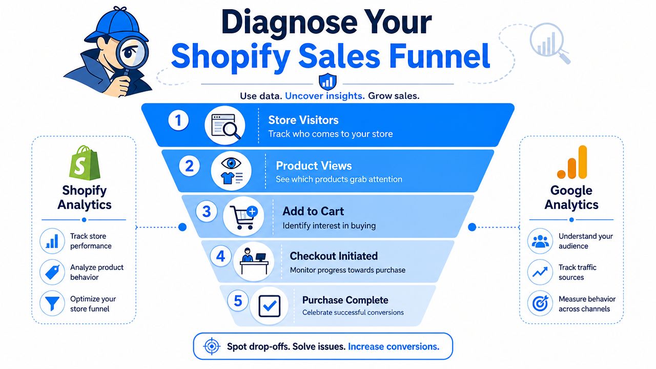
Start with the funnel, not the homepage
Use Shopify Analytics and Google Analytics to inspect five stages:
- Store visitors
- Product views
- Add to cart
- Checkout initiated
- Purchase complete
This sounds basic, but it's where clarity starts. If visitors land and bounce early, your issue is likely intent match, page clarity, or load experience. If people view products but don't add to cart, the problem usually sits on the product detail page. If carts build but checkout starts lag, trust, price surprise, or friction is likely getting in the way.
Here's a simple diagnostic lens:
| Funnel stage | What a weak result usually suggests |
|---|---|
| Visitor to product view | Poor landing-page relevance, weak navigation, unclear offer |
| Product view to add to cart | Weak product copy, poor imagery, low trust, unclear value |
| Add to cart to checkout | Shipping shock, weak cart UX, distraction, hesitation |
| Checkout to purchase | Too many fields, payment friction, mobile pain points |
One visual walkthrough can help if you want to see the funnel logic in action:
Segment before you judge anything
This is the step many stores skip, and it changes the entire diagnosis. Shopify-focused guidance summarized by On Tap Group notes an average conversion rate around 1.4%, but source-specific averages vary widely, including 3.9% for referral, 2.5% for email, and 1.0% for paid search in the cited benchmark set, which is why segmenting conversion by traffic source should happen before you test on-site changes.
That means you shouldn't treat “site conversion rate” as a single truth. A store can look weak overall while email traffic performs well and paid search struggles badly. In that case, the leak may sit in targeting, ad-message match, or cold-traffic landing pages rather than in the product page itself.
Break your funnel by at least these dimensions:
- Traffic source: Referral, email, direct, social, paid search
- Device type: Mobile and desktop behave differently
- Customer type: New vs returning visitors
- Landing page group: Homepage, collection page, product page, campaign page
When a merchant says “my store converts poorly,” my first question isn't about design. It's about which visitors, on which device, from which source.
Turn drop-offs into hypotheses
Once you isolate the weak stage, write a hypothesis that connects user behavior to a fix. Keep it plain.
Good hypotheses look like this:
- Product page issue: Visitors reach the page but hesitate because the offer and trust signals aren't obvious.
- Cart issue: Buyers show intent, then stall because shipping and total cost become visible too late.
- Checkout issue: Mobile users start checkout but abandon because typing and payment selection take too much effort.
Bad hypotheses sound like internal preferences. “The site needs a refresh.” “We need a cleaner theme.” “The CTA should pop more.”
Your goal is to leave this phase with one sentence: the biggest leak in our funnel is X, and we believe it's caused by Y. That's enough to guide strong testing.
Smart Prioritization for Maximum Impact
Once you've found several leaks, don't build a giant backlog and call it strategy. Prioritization matters more than ambition. The right first fix often looks unglamorous, but it compounds faster than a full redesign.
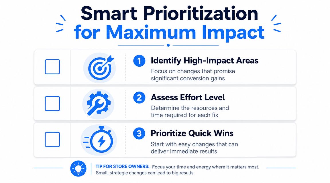
Use a simple scoring lens
I like using an Impact, Confidence, Ease lens, even if you never formalize it in a spreadsheet.
- Impact: If this works, does it affect a major leak or a minor cosmetic issue?
- Confidence: Do you have evidence from analytics, recordings, support tickets, or repeat user behavior?
- Ease: Can your current traffic and team resources support a clean test?
That last point gets ignored. Shopify Community guidance notes that 10 to 30 visits per day isn't enough volume to reliably judge conversion, which is why test selection needs to match your traffic reality. If you don't have much traffic, testing a tiny button-color change usually isn't a smart first move. A stronger offer, simpler product page, or clearer cart messaging creates a bigger signal.
What usually deserves attention first
Here's how three common ideas stack up in practice:
| Experiment | Impact | Confidence | Ease | Priority |
|---|---|---|---|---|
| Clarify shipping and returns on product page | High | High | High | Start here |
| Add an interactive email capture offer | Medium to high | Medium | Medium | Good next test |
| Redesign the full homepage | Unclear | Low | Low | Delay |
A full homepage redesign feels productive because it looks substantial. It also bundles too many variables, takes longer, and often solves the wrong problem.
Decision filter: Prioritize changes that target a proven leak, can be implemented cleanly, and are large enough to produce a detectable outcome with your current traffic.
If your store is still building volume, lean into tests with visible behavioral impact. Sharper value props, simpler product pages, cleaner cart messaging, better mobile layouts, and stronger offer presentation tend to beat subtle design polishing.
High-Impact Plays for Your Shopify Store
Once the diagnosis is clear, execution gets simpler. You don't need a hundred tactics. You need a short list of changes matched to the leak you've found.
Industry guidance summarized by Toptal reports several measurable levers: adding live chat can increase conversion rates by 40%, reducing checkout friction can add 0.3 to 0.5 percentage points, and improving site speed can add 0.4 to 0.7 percentage points. The lesson isn't that every store should rush to install every feature. It's that a few targeted fixes can move the number meaningfully.
Product pages that remove hesitation
Most Shopify stores lose more money on unclear product pages than on ugly ones.
Focus on buying clarity:
- Lead with the offer: Put the core benefit near the title and price. Shoppers shouldn't have to scroll to understand what problem the product solves.
- Answer objections early: Shipping timing, returns, sizing, compatibility, and what's included should sit close to the purchase area.
- Use proof where decisions happen: Reviews, customer photos, and concise trust messaging belong near the add-to-cart section, not buried at the bottom.
- Make selection easy: Variants, quantity, and bundle choices should feel obvious on mobile.
If support tickets keep repeating the same pre-purchase questions, your product page is under-explaining the product.
Checkout fixes that lower friction
Cart and checkout work best when they remove uncertainty. This isn't the place for clever design.
Practical fixes include:
- Guest checkout: Don't force account creation before purchase.
- Fewer fields: Every extra input gives mobile users another reason to stop.
- Clear payment options: Surface the methods your buyers already trust.
- Visible total cost expectations: Surprise at the checkout stage kills momentum.
- Short confirmation cues: Remind buyers about secure payment, returns, or delivery timing without cluttering the page.
A lot of merchants obsess over discount strategy while leaving obvious checkout friction untouched. That's backward. A weaker offer can still convert through a smooth checkout. A strong offer can die in a clumsy one.
Speed, support, and mobile polish
Site speed often gets discussed in abstract terms. Keep it operational.
Audit image sizes. Remove unnecessary apps and scripts. Review popups, trackers, and chat widgets that load too aggressively. Test the store on an actual phone, on a normal connection, with one thumb. That's where friction becomes obvious.
Live chat deserves special attention when hesitation is tied to product questions, shipping concerns, or fit uncertainty. It works best when the team can answer fast and when the store attracts visitors with genuine buying intent. If your traffic is low quality, live chat won't rescue weak targeting.
For mobile-specific execution ideas, this guide to mobile conversion optimization for ecommerce stores is useful because it pushes beyond generic responsive-design advice and focuses on mobile behavior.
A few things consistently work better than merchants expect:
- Shorter above-the-fold sections: Mobile visitors need a quick read on product, price, and action.
- Sticky purchase actions: Especially helpful on long product pages.
- Tap-friendly controls: Variant selectors and quantity controls should be hard to miss and easy to use.
- Faster first impression: If the first screen feels busy, slow, or unclear, the rest of the page won't matter.
A good CRO change doesn't just improve aesthetics. It removes a reason not to buy.
Advanced CRO Tactics and Sample Playbooks
Once the core leaks are patched, the next gains usually come from better attention capture, stronger personalization, and sharper mobile execution. At this stage, good stores start separating from average ones.
Most advanced tactics fail when they're bolted onto a shaky funnel. They work much better when the basics are already solid.
Gamified capture and offer delivery
Mobile traffic changes how you should think about popups and offers. According to guidance summarized by Nosto, 79% of visitors arrive on mobile, with benchmarks showing mobile conversion around 1.8% versus desktop at 3.9%, which is why mobile-first conversion tactics need to go beyond responsive layouts.
Standard email popups often underperform because they interrupt without earning attention. A more effective play is to make the interaction itself part of the experience. Spin-to-win, scratch cards, and similar mechanics can work when they do three jobs at once: capture the email, deliver a one-time offer, and move the visitor back into the purchase path quickly.
One example is exit-intent technology for Shopify stores, which can trigger an offer when a visitor is about to leave rather than interrupting immediately on arrival. In practice, this tends to fit cold traffic better than aggressive instant popups.
I'd use a playbook like this:
- Trigger by behavior: Exit intent, scroll depth, or page count usually beats immediate display.
- Offer one clear reward: Don't combine multiple discounts or choices.
- Keep redemption simple: The coupon should be applied or easy to copy on mobile.
- Exclude buyers and active email subscribers: Otherwise you train your best visitors to wait for discounts.
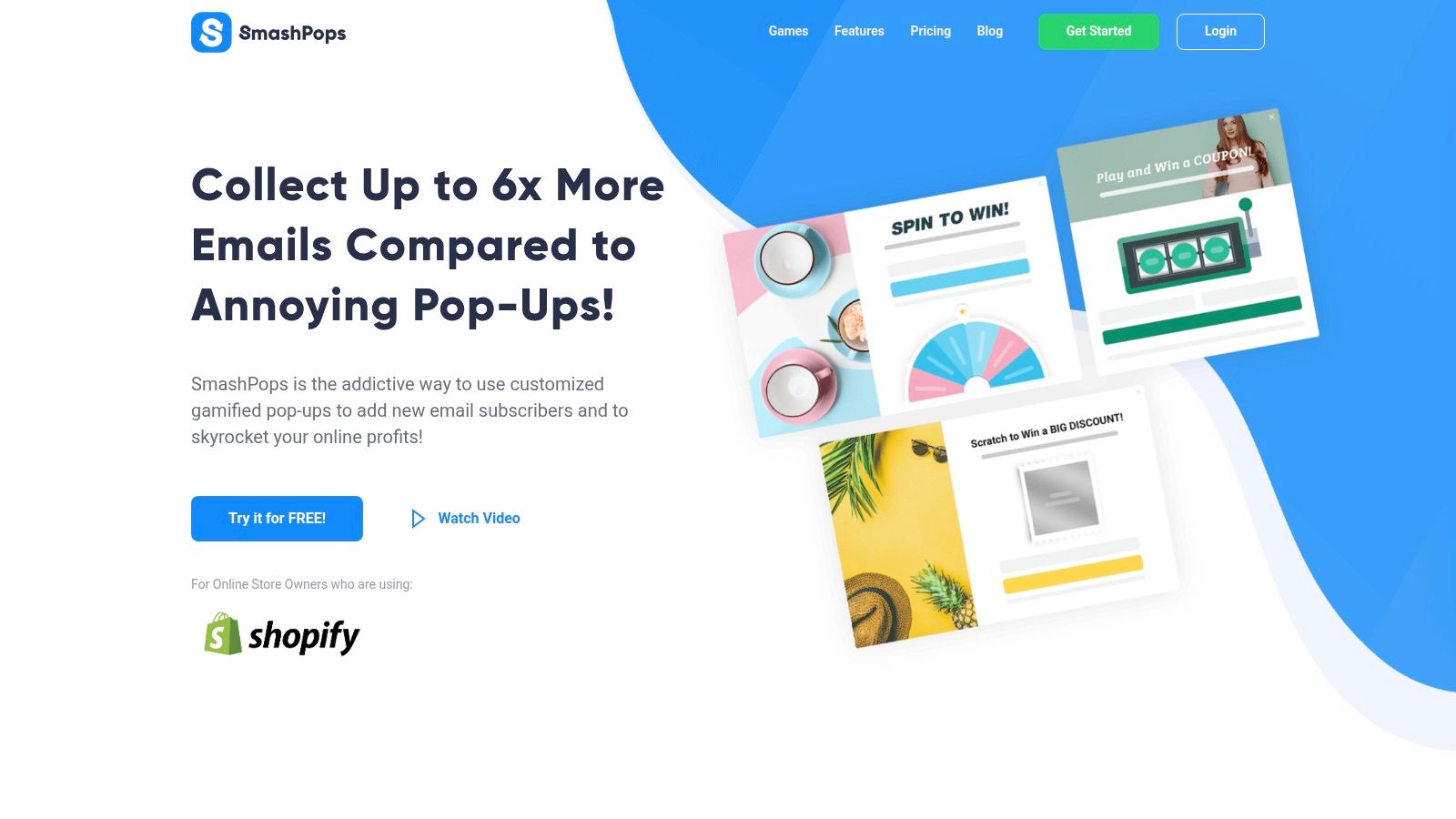
SmashPops is one tool in this category. It offers gamified popups such as spin wheels, scratch cards, and similar formats for Shopify stores. The appeal isn't novelty by itself. It's the ability to turn a passive email ask into a more active exchange.
Personalization and discovery
A lot of conversion loss happens before cart. Visitors don't always know what to look for, and many stores make discovery harder than it needs to be.
Good personalization doesn't have to mean a massive tech stack. It can mean:
- Showing returning visitors products related to what they viewed earlier
- Adjusting collection sorting around bestsellers or relevant categories
- Recommending complementary products on product pages and in cart
- Tailoring onsite messaging for new versus returning shoppers
Search and navigation also matter here. If people keep bouncing between collections, using search awkwardly, or returning to category pages, the leak may be discovery rather than persuasion.
As AI-assisted shopping becomes more common, merchants also need to think beyond onsite UX. This guide to ecommerce AI visibility is useful if you're thinking about how discovery is changing before the customer even reaches your store.
Mobile-first execution
Mobile-first CRO isn't just “make it smaller.” It means accepting that attention is shorter, thumb movement matters, and hesitation appears earlier.
The strongest mobile playbooks usually share a few traits:
| Mobile issue | Better response |
|---|---|
| Visitors bounce before engaging | Shorter first-screen message and clearer offer |
| Product pages feel dense | Break copy into scannable sections and move key proof higher |
| Offer capture gets ignored | Use interactive or behavior-triggered formats |
| Checkout stalls | Reduce typing, simplify payment choice, remove distractions |
Mobile shoppers don't need more persuasion first. They need less friction and faster orientation.
How to Measure and Scale Your CRO Efforts
CRO only compounds when you can tell the difference between a real win and a random fluctuation. That's where many Shopify teams break the process. They launch a change, see a few days of encouraging numbers, and declare success too early.
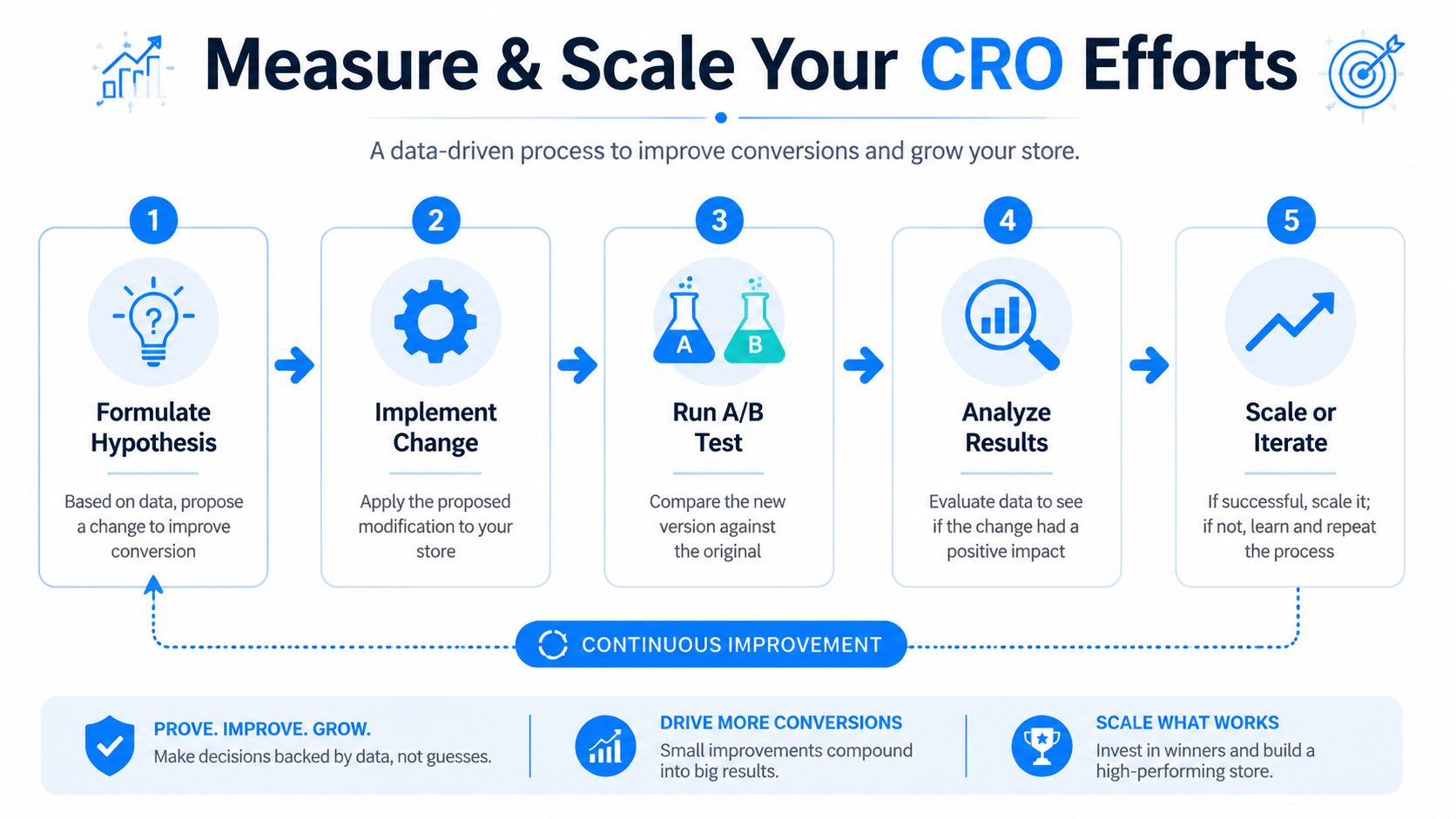
Run cleaner tests
Bloomreach's Shopify CRO guidance stresses two rules that matter more than most merchants realize: change one variable at a time and keep the test running until it reaches statistical significance. Premature winners are common, and they create false confidence.
That means:
- Test one meaningful variable, not five bundled edits
- Keep the control intact so you know what changed behavior
- Record the hypothesis before launch
- Watch the full funnel, not just the top-line conversion rate
If you change headline, imagery, review placement, pricing display, and CTA text at once, you haven't run a test. You've run a redesign.
A practical test might be one of these:
- Rewriting the primary product-page value proposition
- Moving shipping and returns messaging closer to add to cart
- Reducing checkout fields
- Testing a behavior-triggered offer against a standard popup
Build a repeatable learning loop
The stores that improve steadily treat CRO like operations, not inspiration.
A simple loop works:
- Observe the leak
- Write a hypothesis
- Launch one controlled change
- Review result quality
- Keep, discard, or iterate
Use a test log. It doesn't need to be fancy. Track the page, audience, variable changed, start date, end date, and outcome. Over time, this becomes your store's private playbook.
This matters outside conversion too. If you're paying for traffic, every failed landing-page assumption gets more expensive. That's why understanding how cost per click is calculated in paid acquisition helps frame CRO work properly. Better conversion makes your traffic economics more forgiving. Poor conversion forces media buying to carry too much weight.
Keep this standard: If a test doesn't teach you exactly what changed buyer behavior, it wasn't structured tightly enough.
The discipline is simple but demanding. Diagnose carefully. Prioritize hard. Test cleanly. Scale only what you've proved.
If you want to turn email capture into a more conversion-focused part of the funnel, SmashPops is a practical option to evaluate. It lets Shopify stores deploy gamified popups with behavior-based triggers, one-time coupon delivery, and integrations with common email tools, which makes it relevant when your leak sits around attention, hesitation, or exit behavior rather than core checkout UX.