
When mobile page load time jumps from 1 second to 10 seconds, bounce probability rises by 123%, and 54.5% of global website traffic now comes from mobile devices, according to Eleken's UX statistics summary. That combination should change how most store owners think about mobile. Your mobile site isn't a trimmed-down version of desktop. It's the front door for a majority of shoppers, and small points of friction cost real sales.
I see the same pattern in ecommerce audits over and over. Stores invest in product photography, ad creative, and email flows, then send paid traffic to a mobile experience that asks users to pinch, wait, hunt, and re-enter information. The problem usually isn't one catastrophic flaw. It's a stack of tiny annoyances that make buying feel harder than it should.
This guide looks at mobile user experience the way a store owner should. Not as a design trend, and not as a developer-only topic, but as a conversion system. If your mobile traffic is high and your sales lag behind expectations, this is usually where the leak starts.
Table of Contents
- What Is Mobile User Experience and Why It Matters Now
- Why Your Mobile Site Is Your Most Important Sales Channel
- The Core Principles of High-Converting Mobile UX
- Common Mobile Design Patterns and Fatal Pitfalls
- How to Measure Your Mobile Experience
- A Simple Workflow for Testing and Optimization
- Shopify Quick Wins for a Better Mobile Experience
What Is Mobile User Experience and Why It Matters Now
Mobile user experience is the sum of how easy it feels for someone to browse, evaluate, and buy from your store on a phone. That includes speed, readability, navigation, form input, button placement, checkout flow, and how well the site recovers when the user gets interrupted.
For an ecommerce business, mobile UX isn't mainly about looking modern. It's about reducing the effort required to complete a purchase. Every extra tap, every layout shift, every slow-loading image, and every confusing form field creates doubt. On desktop, a user might tolerate that friction. On mobile, they usually leave.
A useful way to think about mobile UX is this. Your shopper is standing in line, switching between apps, checking a text message, and trying to buy with one thumb. That is the environment. If your site assumes a calm, uninterrupted session with perfect attention, it's designed for the wrong context.
Practical rule: A good mobile site helps people resume. A weak one makes them restart.
That distinction matters because most mobile conversion problems don't come from weak intent. They come from broken momentum. Someone taps a product ad, lands on a cluttered product page, loses the Add to Cart button below stacked banners, opens the menu, gets buried in categories, then gives up. The store had demand. The interface wasted it.
Mobile user experience also affects loyalty. If a customer's first order feels awkward, they won't be eager to return, even if the product is good. When the buying flow feels fast and obvious, people trust the store more. That trust carries into repeat visits, email signups, and direct traffic later.
Why Your Mobile Site Is Your Most Important Sales Channel
A lot of store owners still treat mobile as secondary because they manage the business on a laptop. Their customers don't shop that way. Many discover products on social platforms, compare options in a browser, and buy in short bursts throughout the day from their phones.
According to UXCam's UX statistics, 60% of online shoppers exclusively use mobile devices to make shopping decisions, and 50% of eCommerce revenue is generated from mobile devices. That makes mobile UX a revenue issue, not a cosmetic one.
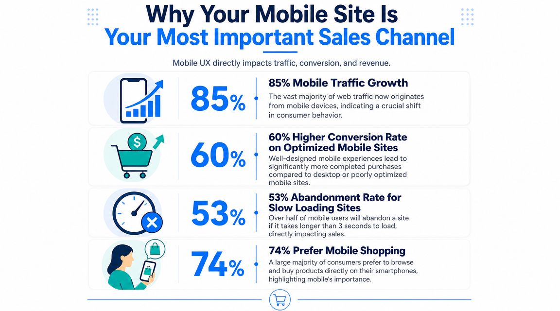
If half your revenue comes through mobile, the mobile storefront has to do four jobs well:
It has to sell quickly
Mobile users don't browse with much patience. They scan. They compare. They make snap judgments about trust, price, fit, delivery, and ease. If your product page buries shipping information, hides variants, or makes the Add to Cart button hard to reach, you create hesitation exactly where you need confidence.
It has to support research behavior
Many shoppers don't move in a straight line from landing page to checkout. They open multiple tabs, revisit later, and jump between product pages and collection pages. On mobile, that behavior becomes more fragile because the screen is small and interruptions are constant. Your site should make it easy to return to a category, re-open a product, and continue without losing context.
It has to protect paid traffic
A weak mobile experience wastes acquisition spend. If you buy traffic from Meta, Google Shopping, influencers, or email campaigns, that traffic often lands on mobile product pages first. If the first screen doesn't clarify the product, price, and next action, your media buying works harder than it should.
The easiest way to lower ad efficiency is to send qualified traffic into friction you could have removed.
It has to reinforce brand trust
Customers often judge a store's reliability by the buying experience as much as by the product itself. Sloppy spacing, jumpy elements, hard-to-close popups, and cramped checkout fields signal risk. Clean mobile flows signal competence.
Here's the business trade-off in simple terms:
| Mobile decision | What happens in practice |
|---|---|
| Prioritize speed and clarity | Shoppers find products faster and complete more sessions without confusion |
| Overload pages with banners and widgets | Shoppers struggle to identify the main action and abandon earlier |
| Design around thumb use | Buying feels easy in real-world mobile conditions |
| Reuse desktop logic on mobile | Navigation and checkout feel cramped, hidden, or tedious |
If you run an ecommerce store, your mobile site isn't just one channel among many. For many buyers, it is the store.
The Core Principles of High-Converting Mobile UX
The fastest way to improve mobile user experience is to stop thinking in terms of pages and start thinking in terms of tasks. Can the user find a product, understand it, choose a variant, add it to cart, and check out without strain? That question exposes most design issues quickly.
A strong mobile experience usually comes down to a few durable principles. They sound simple, but stores ignore them all the time.
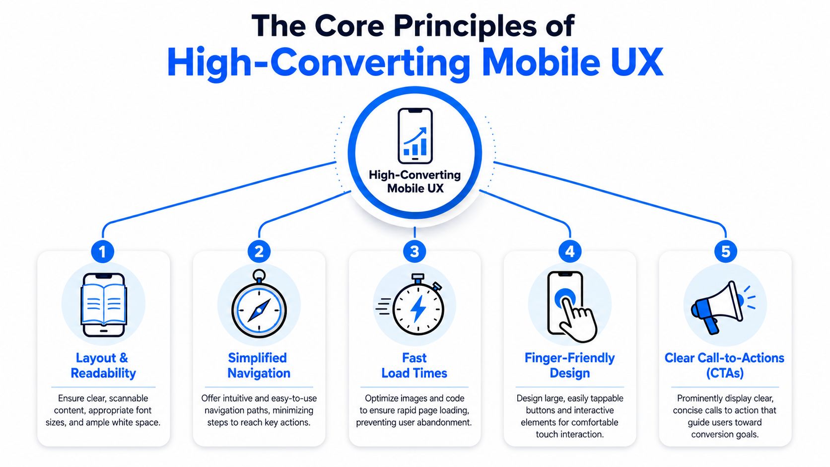
Readability beats density
Mobile pages often fail because they try to fit too much above the fold. Tiny text, cramped badges, stacked announcements, and long product descriptions make scanning harder.
For ecommerce, readable content means:
- Clear hierarchy: Product title, price, variant options, and primary action should stand out immediately.
- Shorter chunks: Break product copy into brief sections, bullets, and expandable panels.
- Visible reassurance: Put shipping, returns, and trust cues near the decision point, not hidden in tabs no one opens.
If the first screen feels busy, the customer has to work to understand your offer. That work lowers conversion.
Navigation should reduce choices, not hide them
Many menus on mobile create confusion because they're built for internal teams, not shoppers. The category structure makes sense to the merchant, but not to the customer trying to find one item quickly.
Good mobile navigation does three things well:
- Shows obvious top paths such as Shop, Search, Cart, and key collections.
- Keeps labels plain instead of using clever wording.
- Helps users back out easily when they choose the wrong path.
If your store has a large catalog, search and filters matter as much as menus. Collection pages should support narrowing without forcing the user through multiple dead ends.
A practical refresher on UX design fundamentals can help teams align around these basics before they start redesigning templates.
Touch design needs margin for error
Phones are used with thumbs, in motion, and under distraction. Small links and tightly packed controls create expensive mistakes. I've seen stores lose intent because shoppers tapped the wrong variant or missed a close icon on a popup.
Use larger tap targets, generous spacing, sticky primary actions where appropriate, and input fields that are easy to activate. On product pages, the Add to Cart button should never feel like a moving target.
After the visual basics, it helps to watch a practical breakdown in motion:
Performance is part of the interface
A page can be visually polished and still fail because it loads slowly. According to Design TLC's mobile UX statistics roundup, 53% of mobile users abandon a site if it takes longer than three seconds to load, and 90% of smartphone users say they're more likely to continue shopping when they have a great user experience.
For a merchant, that means performance work should focus on conversion-critical screens first:
- Homepage and landing pages: Remove heavy elements that delay first interaction.
- Collection pages: Keep filtering and product thumbnails responsive.
- Product pages: Prioritize image delivery, variant responsiveness, and Add to Cart feedback.
- Checkout: Strip out distractions and reduce delays between steps.
Accessibility improves revenue, not just compliance
Accessible mobile design helps more people complete tasks under more conditions. High contrast text, meaningful labels, predictable buttons, and form fields that are easy to understand all reduce failure.
Accessibility also improves ordinary shopping behavior. Someone browsing outdoors in poor light, using one hand, or dealing with a cracked screen benefits from the same improvements as someone using assistive technology.
Better mobile UX usually doesn't come from adding features. It comes from removing friction at the exact moment someone wants to act.
Common Mobile Design Patterns and Fatal Pitfalls
On mobile, design patterns are rarely neutral. Some reduce effort and guide shoppers forward. Others create confusion, hide key actions, or interrupt the session at the wrong time. The difference shows up quickly in add-to-cart behavior and checkout completion.
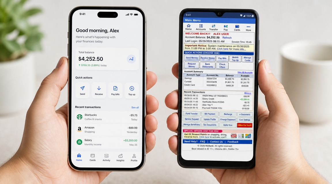
Patterns that usually help conversion
The best mobile patterns support the shopper's next likely step without asking them to think too much.
| Do this | Why it works |
|---|---|
| Use a sticky Add to Cart on long product pages | The action stays available after users scroll through images, reviews, and details |
| Keep search prominent | Search often beats deep menu drilling on mobile, especially for repeat visitors |
| Use accordion sections for product details | Shoppers can scan headings without facing a long wall of text |
| Show a persistent cart entry point | Users can recover their path quickly without hunting for the basket |
One principle matters more than it looks. Mobile sessions are often interrupted. Nielsen Norman Group's guidance on mobile UX emphasizes minimizing steps and saving user context so people can recover after distractions. For ecommerce, that means preserving cart state, remembering form entries, and making return paths obvious.
A few practical examples:
- Product filters should stay applied when a user returns from a product page to the collection.
- Cart contents should persist even if the user leaves to check a text or compare prices.
- Checkout forms should preserve progress so the user doesn't need to restart after an interruption.
Patterns that often hurt conversion
Some common choices look tidy in a design mockup but perform badly in real shopping conditions.
Hiding too much inside the hamburger menu
Hamburger menus can help with space, but stores often overuse them. If key shopping paths, account access, support, or sale collections are buried excessively, shoppers lose orientation fast. On mobile, hidden navigation is often forgotten navigation.
Homepage carousels that rotate the main message
Carousels usually dilute focus. The first slide carries the weight, the rest often go unseen, and movement competes with product discovery. One strong message with one clear action is usually more effective than multiple rotating promos.
Full-screen popups that block buying
Email capture matters, but mobile popups can easily become hostile. If the close icon is hard to hit, the timing is aggressive, or the offer interrupts product selection, the popup steals attention from the sale.
A better approach is to use lighter-touch formats and tighter targeting rules. On Shopify, tools like OptiMonk, Wisepops, or SmashPops can be configured with device-based display rules so mobile visitors see teaser bars, delayed offers, or exit-triggered interactions instead of immediate full-screen takeovers.
If a popup is easier to open than close, it's hurting the mobile experience.
Long checkouts with fragile forms
Nothing kills momentum faster than a mobile checkout that feels like paperwork. Requiring too many fields, failing to preserve entries, or forcing awkward coupon and shipping interactions adds stress at the final step.
The rule is simple. Mobile users don't want to decode the interface. They want the shortest reliable path to purchase.
How to Measure Your Mobile Experience
You can't improve mobile user experience by staring at your homepage and guessing. You need a small set of indicators that tell you where mobile shoppers struggle, and then you need session-level evidence that explains why.
The dashboard I would build first
If I were setting up reporting for a Shopify store, I'd start with mobile-only views in GA4 and compare them against desktop. Not to chase vanity metrics, but to identify points where mobile users lose momentum.
Focus on these signals first:
- Mobile landing page performance: Look at which entry pages attract mobile traffic and where users leave quickly. This often surfaces ad-to-page mismatch or weak first-screen content.
- Product page engagement by device: Check whether mobile product pages underperform relative to desktop on progression to cart.
- Cart and checkout drop-off on mobile: If product interest is healthy but checkout completion is weak, the issue is often form friction, coupon confusion, or distracting elements.
- Conversion rate by device category: This isn't enough on its own, but it tells you where to investigate deeper.
A simple question helps interpret every chart: where does buyer intent appear to weaken? That wording matters because sometimes intent isn't weak at all. The interface is.
Use behavior tools to explain the numbers
Analytics tells you where the leak is. Behavior tools show you the leak itself. Heatmaps, tap maps, and session recordings are especially useful on mobile because small usability issues are hard to detect from aggregate reports.
Look for patterns like:
- Repeated taps on non-clickable elements, which often means the design suggests an action that doesn't exist.
- Rage taps near small controls, especially on popups, filters, and variant selectors.
- Back-and-forth movement between product and collection pages, which can indicate poor comparison support or weak saved context.
- Form hesitation, where users stop, edit, and re-enter information at checkout.
Qualitative feedback matters too. If you need a lightweight process, collect short on-site surveys, post-purchase prompts, and support-tag reviews. This guide on getting customer feedback for your ecommerce site is a practical way to structure that input without turning it into a research project.
Good measurement doesn't produce more dashboards. It produces a shorter list of fixes.
A Simple Workflow for Testing and Optimization
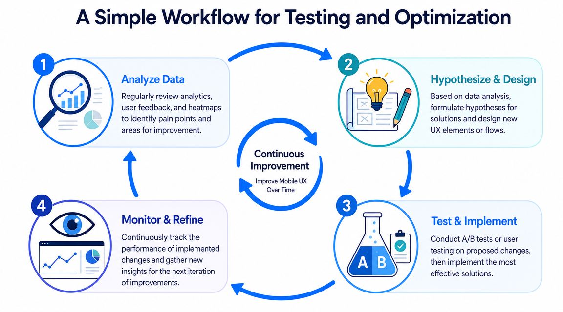
Most stores don't need a massive CRO program to improve mobile user experience. They need a repeatable process that turns one observed problem into one tested fix.
Start with one painful task
Pick one task where mobile users commonly stall. Product discovery, variant selection, add-to-cart, cart review, and checkout are usually the right places to start. Don't start with a full redesign. Start with the narrowest high-impact problem.
Then work through a simple loop:
Analyze the evidence
Review mobile funnel reports, recordings, support tickets, and on-site feedback. Write down the friction in plain language. Example: shoppers scroll past the Add to Cart button because it disappears after the image gallery.Form a sharp hypothesis
Keep the statement specific. Example: a sticky Add to Cart bar on mobile product pages will help users act after reviewing product details.Design the smallest possible change
Avoid bundling multiple ideas into one test. If you change the layout, copy, button color, reviews module, and shipping message at once, you won't know what caused the outcome.Implement and watch behavior closely
Even before you have enough test data to choose a winner, session reviews can reveal if the change introduced confusion.
If you want a practical reference for this process, Uxia's mobile testing guide offers a useful overview of how to evaluate mobile websites methodically.
Run smaller tests with cleaner hypotheses
Store owners often test changes that are too broad. “New mobile product page” is not a strong test idea. “Move shipping reassurance above the Add to Cart button” is much better. Smaller tests reduce risk and teach you more.
A good prioritization filter is:
| Test idea | Prioritize when |
|---|---|
| Checkout simplification | Mobile users reach checkout but fail to finish |
| Sticky CTA or clearer product actions | Product interest is strong but carts are weak |
| Navigation or search improvements | Users struggle to find products efficiently |
| Popup timing and format changes | List growth efforts are interrupting purchase behavior |
For mobile overlays and list-growth tools, test restraint before creativity. Start with softer timing, lower visual obstruction, and device-specific behavior. This walkthrough on testing whether your popup works well on your website is useful if your offers are competing with core shopping actions.
The point of testing isn't to validate opinions. It's to remove guesswork from profitable changes.
Shopify Quick Wins for a Better Mobile Experience
Shopify stores usually don't need a full rebuild to improve mobile user experience. A handful of focused changes can remove friction fast.
The highest-impact fixes to check first
- Audit your theme on a real phone: Don't rely on desktop preview mode. Test navigation, collection filtering, variant selection, cart editing, and checkout entry with one hand.
- Reduce homepage clutter: If the first mobile screen is stacked with announcement bars, sliders, badges, and app widgets, strip it back. One clear message is easier to act on.
- Make product pages easier to scan: Put price, variant selectors, shipping reassurance, and Add to Cart in a clean vertical flow. Push secondary content lower.
- Control popup behavior on mobile: Use teaser bars, delayed prompts, or exit-style triggers instead of immediate full-screen interruptions.
- Trim app bloat: Every app script has a cost. Remove anything that doesn't directly help merchandising, conversion, support, or retention.
For lead capture specifically, the offer matters, but the delivery matters just as much. If you're using discounts, bundles, or content offers, this list of lead magnet examples for ecommerce profitability can help you match the offer to the moment without making mobile visitors fight the interface.
One rule that prevents a lot of mistakes
Treat every mobile element as if it has to earn its place. If a badge, widget, banner, app block, or popup doesn't clearly help a shopper choose, trust, or buy, it's probably making the page harder to use.
The best-converting Shopify mobile experiences usually feel lighter than the merchant expected. Fewer interruptions. Cleaner product pages. Simpler menus. Faster feedback. That's what buying comfort looks like on a phone.
If you want to grow your list without turning your mobile site into a wall of intrusive popups, SmashPops is one option to consider. It lets Shopify stores use gamified popups, teaser bars, reminder bars, and device-based targeting so you can tailor email capture for mobile visitors while keeping the shopping flow usable.
