You're getting traffic. Product pages are live. Paid clicks are landing. Some people browse, a few add to cart, and most leave without giving you anything to work with later.
That's usually the moment a Shopify merchant starts looking for a Shopify popup app. Not because popups are exciting, but because anonymous traffic is expensive to waste. The problem is that most popup setups are lazy. They interrupt too early, say nothing interesting, and look clumsy on mobile. Visitors close them on reflex.
A popup can still be one of the most impactful tools in a Shopify store. It just can't behave like a blunt instrument. It has to show up with the right message, in the right format, at the right time. If you're also tightening acquisition and organic visibility, this Shopify SEO strategy guide is a useful companion because better traffic only matters if your store captures and converts it.
The app ecosystem is crowded, which makes sloppy selection expensive. As of 2026, the Shopify App Store lists 419 pop-up apps, while 87% of merchants use apps and install an average of 6 apps each, according to Craftberry's Shopify app store statistics roundup. In other words, a popup app isn't rare infrastructure. It's standard. The difference comes from execution.
That's where most advice falls short. It compares templates, colors, and surface features, but skips the harder question: how do you use popups without annoying shoppers or hurting the mobile experience? If mobile UX is already a weak spot in your funnel, this guide to mobile conversion optimization is worth reading alongside your popup strategy.
Table of Contents
- Introduction From Traffic to Treasure
- What Is a Shopify Popup App (And What It Is Not)
- Must-Have Features and Targeting Triggers
- From Interruptive to Interactive The Power of Gamification
- Best Practices for Popup Setup and Optimization
- Measuring Success and Integrating Your Tools
- Conclusion Turning Popups into Your Growth Engine
Introduction From Traffic to Treasure
A lot of Shopify stores have the same hidden leak. Traffic arrives, browses for a minute, maybe two, and disappears before the brand earns a click, an email, or a sale. The store owner responds by adding a generic discount popup and hopes that solves it.
Usually it doesn't.
A Shopify popup app matters because it gives you a chance to convert unowned traffic into an audience you can reach again. That can mean an email signup, an SMS opt-in, a coupon redemption, or a recovered cart. But the app itself isn't the strategy. It's the delivery mechanism.
The real job of a popup
The practical job of a popup is simple: create a useful interruption. Not a random one. Not an aggressive one. A useful one tied to visitor intent.
That distinction matters more on Shopify than people realize. Shopify operates at enormous scale, with over 5 million active stores in 2025 and 875 million shoppers in 2024, according to a 2026 Shopify ecosystem snapshot. On a platform that large, converting anonymous visits into owned attention isn't a side tactic. It's part of core store operations.
Practical rule: If your popup would annoy a customer in a physical store, it'll probably annoy them online too.
Beyond the checklist mentality
Most merchants start by comparing apps based on templates or ratings. That's reasonable, but it's incomplete. The better question is how the app helps you control timing, relevance, and friction. Those are the levers that separate helpful onsite prompts from conversion-killing interruptions.
A strong popup strategy doesn't just collect more emails. It protects the shopping experience while doing it. That's why format choice, mobile behavior, and targeting logic matter as much as the incentive itself.
What Is a Shopify Popup App (And What It Is Not)
A Shopify popup app is a tool that places targeted onsite messages in front of visitors based on rules you control. Those messages can ask for an email, offer a coupon, announce a launch, prevent an exit, promote a bundle, or guide a shopper toward a product page.
The mistake is thinking of it as just a box that asks for contact information.
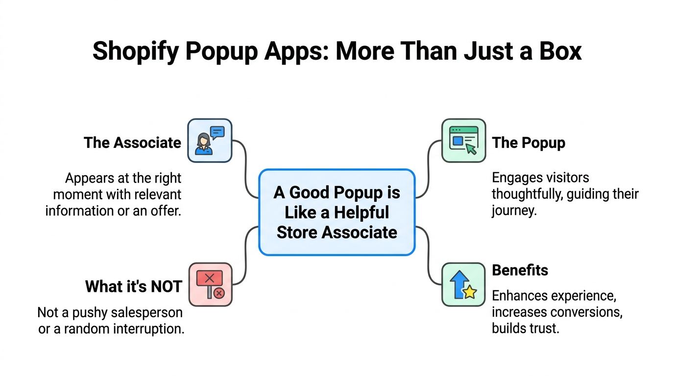
The useful mental model
A good popup behaves like a helpful store associate. It notices context. It doesn't greet every customer by stepping in front of the door. It waits until the shopper hesitates, shows interest, or needs a reason to continue.
A bad popup behaves like a pushy street marketer. It interrupts instantly, blocks the screen, asks for too much, and offers nothing that feels relevant.
That's why popup quality isn't mostly about design polish. It's about judgment. Good judgment means matching the prompt to the moment. If you want a practical way to vet app quality beyond screenshots and app store claims, this app store research's app evaluation framework is a solid reference.
The main popup formats
Not every popup should be a full-screen modal. Different jobs call for different formats.
| Format | Best use | Common mistake |
|---|---|---|
| Modal popup | Welcome offers, email capture, cart-saving incentives | Showing it too early |
| Slide-in | Lower-friction reminders, product nudges, blog-to-email capture | Making it too small to notice |
| Announcement bar | Shipping updates, sitewide promos, low-friction notices | Stuffing too much text into it |
| Gamified popup | Interactive discounts, list growth, first-visit engagement | Using it where a simple answer is better |
| Teaser or tab | Reopening an offer without forcing it on visitors | Hiding the value proposition |
A popup isn't automatically intrusive. It becomes intrusive when it ignores context.
What it's not
It's not a substitute for weak product pages. It's not a fix for poor traffic quality. It's not a permission slip to cover your mobile screen with a discount wheel before a visitor has seen your offer.
Used well, a Shopify popup app creates a smart touchpoint in the journey. Used badly, it trains shoppers to dismiss your brand.
Must-Have Features and Targeting Triggers
If you're comparing popup tools, don't start with the flashiest templates. Start with control. The best-performing setups usually come from apps that give you precise rules, clean analytics, and enough flexibility to test without breaking the onsite experience.
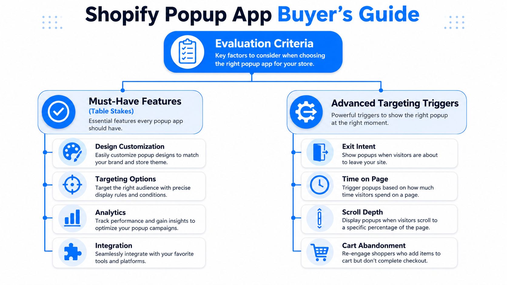
The table stakes
A usable Shopify popup app should include a few basics.
- Flexible design controls so the popup matches your store instead of looking bolted on.
- A visual editor that lets marketers launch and change campaigns without developer help.
- Built-in reporting so you can see views, submissions, and coupon usage without guessing.
- Testing capability because offers, copy, and trigger timing rarely work best on the first try.
- ESP and Shopify integrations so captured leads and coupons don't live in a silo.
None of that is advanced. It's the minimum.
Where merchants get into trouble is choosing an app that does the basics but gives them weak control over who sees what and when. That's where popup fatigue starts.
The triggers that actually matter
A key differentiator is targeting. Effective popup apps combine behavioral triggers such as exit intent, scroll depth, time delay, device type, referrer, and page-specific rules with Shopify data like cart value, products viewed, checkout progress, purchase history, and customer tags, as described in Wisepops' overview of Shopify popup app capabilities.
That matters because the trigger determines whether a popup feels relevant or random.
Here's how I'd think about the main ones:
Exit intent
Best for visitors who are about to leave product, collection, or cart pages. It works because it catches hesitation at the edge of abandonment, not at arrival. If you want a deeper explanation of how that logic works in practice, this breakdown of exit intent technology is useful.
Scroll depth
Useful on blog posts, long product pages, and educational landing pages. A visitor who has scrolled deep into a page has shown attention. That's a much better moment for a content upgrade, a first-order incentive, or a related product prompt than a page-load popup.
Time delay
This is often overused. A timer alone isn't intelligence. Still, it can work on homepages or collection pages where you want to give the visitor a short window before presenting an offer.
Cart value and cart state
High-value carts deserve different treatment than low-intent browsing. Someone with products in cart is already doing more than someone on a first homepage glance. Your messaging should reflect that.
Device type and referrer
Mobile visitors need smaller, less obstructive experiences. Paid social traffic may need a different offer than branded search or email-returning visitors. Referrer-based rules help you avoid showing the same message to everyone.
What works: trigger based on behavior plus page context.
What fails: one popup, one delay, all visitors.
A quick evaluation filter
Before installing any app, ask these questions:
- Can I suppress popups on mobile or swap in a lighter format?
- Can I target by cart status, product view, and traffic source?
- Can I exclude existing subscribers or customers?
- Can I test timing, format, and offer without rebuilding campaigns from scratch?
- Can I measure outcomes beyond raw email capture?
If the answer is mostly no, you're buying convenience, not control.
From Interruptive to Interactive The Power of Gamification
Traditional popups often fail for a simple reason. Shoppers have seen the same “join our list for a discount” message too many times, on too many stores, in too many identical boxes.
That doesn't mean the incentive is wrong. It means the interaction is stale.
Why standard discount popups wear out fast
A basic email form asks the visitor to do work. Type your email. Trust the brand. Evaluate the offer. Decide now. That's a lot of friction for a first touchpoint, especially when the creative is generic.
That's one reason standard popup tools often sit in the 2% to 8% opt-in range, while more advanced behavioral systems can reach 15% to 35% in some cases, as noted earlier in the traffic-to-audience discussion. The difference isn't magic. It's engagement.
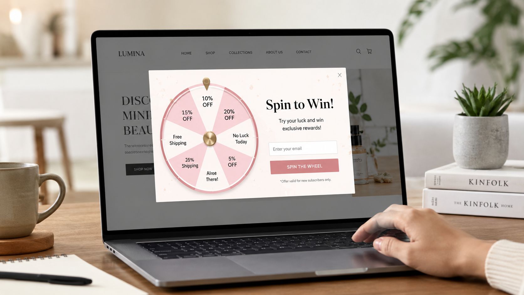
Gamified formats change the emotional texture of the moment. A wheel, scratch card, card pick, or other interactive mechanic gives the visitor a micro-experience before asking for commitment.
Why games change the interaction
Gamification works because it turns a transaction into participation. Instead of “give us your email for 10% off,” the visitor gets a small moment of curiosity, anticipation, and reward. That lowers resistance.
The strongest versions usually rely on a few principles:
- Curiosity because the visitor wants to see what they'll get.
- Reciprocity because the brand offers a reward in a more memorable way.
- Progress because the interaction feels like movement, not a static demand.
- Attention because a game pattern breaks banner blindness better than another plain form.
A tool like SmashPops fits this use case by offering gamified popup formats such as spin wheels, scratch cards, and pick-a-prize interactions, along with display rules, coupon generation, and email integrations. That kind of setup is useful when your standard form has stopped earning attention.
One caution. Gamification isn't automatically the right choice everywhere. On a checkout step, a simple cart-saver prompt may outperform a game because the shopper wants speed, not novelty. On a first visit or exit from a product page, the game format often has more room to work.
For a broader look at why interactive formats can outperform static promotions, this guide to interactive content marketing gives the underlying logic.
A quick example helps here. If you're selling premium skincare, a spin wheel on first exit can feel playful and low-risk. If you're selling replacement parts to a repeat B2B buyer, that same wheel may feel off-brand. Context still decides.
A short demo makes the contrast clear:
Best Practices for Popup Setup and Optimization
A popup campaign usually succeeds or fails on four decisions: the offer, the copy, the design, and the timing. Merchants often obsess over the first and ignore the other three.
That's why plenty of decent discounts still underperform.
Offer and copy
The offer has to match visitor intent. A first-time visitor may respond to a welcome discount, free shipping prompt, or giveaway entry. A returning product viewer may need urgency, social proof, or a cart-specific incentive. One offer for every visitor segment is lazy targeting dressed up as simplicity.
Copy should answer one question fast: why should I care right now?
Keep it tight:
- Lead with the benefit instead of the brand slogan.
- Make the next step obvious with a direct button label.
- Reduce ambiguity about what happens after signup.
- Avoid fake urgency if you're not running a time-sensitive promotion.
If your popup headline could appear on any store in your category, it's too generic.
Design and timing
Popup design should feel native to the site. The fastest way to kill trust is to show a popup that looks like it came from a different brand, with mismatched fonts, overloaded colors, and a giant coupon badge fighting for attention.
Timing matters even more on mobile. Full-screen interruptions, tiny close icons, and stacked form fields create friction fast. Many stores would do better with a slide-in, teaser tab, or reminder bar than a dominant modal on small screens.
A good mobile setup often looks like this:
| Element | Better choice on mobile | Worse choice on mobile |
|---|---|---|
| Format | Slide-in or compact modal | Large blocking overlay |
| Copy length | Short and scannable | Multi-line explanation |
| Input fields | One clear field | Email, phone, name, checkbox stack |
| Dismissal | Obvious close button | Tiny or hidden close icon |
For broader conversion principles outside the popup itself, this article on boosting ecommerce sales pairs well with onsite capture strategy.
The setup habits that tend to work
- Delay the ask until intent exists. Let product interest develop first.
- Use lighter formats on mobile. Preserve the shopping flow.
- Exclude people who already converted. Existing subscribers don't need the same signup ask.
- Match format to job. Announcement bars announce. Exit popups recover. Games engage.
- Cap frequency. Even a strong popup becomes annoying when repeated too often.
Shoppers don't hate popups as much as they hate being interrupted without a reason.
Measuring Success and Integrating Your Tools
If you only look at email captures, you'll miss what your popup is really doing. Some campaigns collect a lot of addresses and produce weak downstream revenue. Others capture fewer leads but attract better buyers.
That's why measurement has to go beyond vanity metrics.
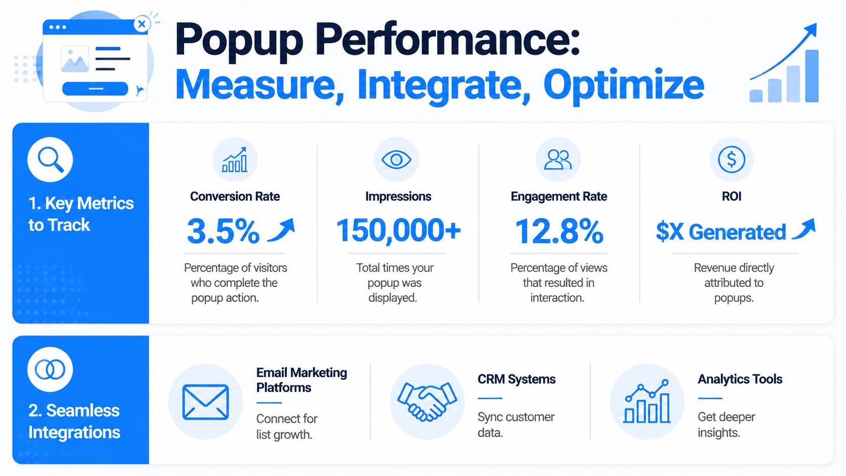
What to measure
A practical dashboard for a Shopify popup app should include:
- Impressions to show how often the campaign is displayed.
- Opt-in rate to show how many viewers take the desired action.
- Coupon usage or redemption behavior to reveal whether the offer drives actual purchase intent.
- Attributed sales so you can connect popup exposure to revenue, not just list growth.
- Dismissal patterns because excessive closes can signal poor timing or bad formatting.
Those metrics tell different stories. High impressions with weak engagement usually means the message is off or the trigger is premature. High signups with poor coupon use may mean the incentive attracts low-intent subscribers. Good attributed sales with moderate lead volume often means the popup is reaching the right people.
Why integrations matter
A popup on its own is only a partial system. It becomes useful when it connects to the rest of your stack.
Email integrations with platforms like Klaviyo or Mailchimp let you route new leads into welcome flows, segment by source, and suppress people who have already subscribed. Shopify coupon integration matters too, especially when the app can generate unique codes automatically instead of recycling one public discount code across every session.
That helps with two things:
- Cleaner attribution, because you can tie code use back to a campaign.
- Less abuse, because one-time codes are easier to control than generic offers.
Measure what the popup produces after the signup, not just at the signup.
Testing should be continuous
A/B testing works best when you isolate variables. Test one thing at a time: headline, incentive, trigger timing, format, or page target. Don't redesign everything at once and call the winner “proven.”
The stores that get the most from popup software usually treat it like paid creative. Launch, watch behavior, adjust, repeat.
Conclusion Turning Popups into Your Growth Engine
The difference between a popup that converts and a popup that gets closed isn't subtle. One respects context, fits the shopping journey, and gives the visitor a reason to engage. The other interrupts because it can.
That's the shift that matters. A Shopify popup app shouldn't be treated like a generic email collection widget. It should be part of your conversion system.
The strongest setups tend to share three traits. They use contextual targeting instead of blanket display rules. They choose a format that matches the moment, including gamified experiences when standard forms have gone stale. And they rely on measurement and iteration, not guesswork.
If your current popup strategy is little more than “show 10% off after a few seconds,” there's room to improve without making the site more annoying. In many stores, the win comes from doing less, but doing it with more precision.
That's also why tools built around interactive formats, targeting controls, mobile-aware presentation, and measurable outcomes have become more useful than simple popup builders. The app isn't the advantage by itself. The advantage is what it lets your store do with better judgment.
If you want to put that approach into practice, SmashPops offers gamified Shopify popups with customizable game formats, targeting rules, coupon generation, integrations, and performance tracking, so you can test a more interactive approach without rebuilding your whole onsite capture strategy.