You're probably looking at the same pattern most Shopify owners eventually hit. Traffic comes in, product pages get views, carts fill up, and then a chunk of shoppers disappears right before the decision point. Not because your store is broken, but because hesitation is normal. Shipping surprises, comparison shopping, distraction, poor timing, mobile friction. It all shows up at once.
That's where Exit Intent Technology earns its keep. Used well, it gives you one last chance to keep the sale, capture the email, or at least learn why the visitor is leaving. Used badly, it becomes just another popup people close on instinct.
The difference is precision. Generic site-wide offers are getting harder to justify. The stores that still get strong ROI from exit intent are usually the ones treating it as a segmented recovery layer, tuned by page type, buyer intent, and device.
Table of Contents
- Understanding Exit Intent and How It Works
- The Business Case for Exit Intent in Ecommerce
- Practical Exit Intent Use Cases for Shopify Stores
- Implementing Exit Intent The Right Way
- Advanced Strategies and Modern Challenges
- Measuring Success and Troubleshooting
- Frequently Asked Questions About Exit Intent
Understanding Exit Intent and How It Works
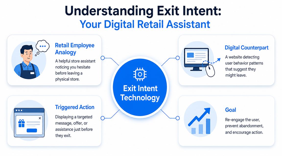
A good way to think about exit intent is a store associate who notices you turning toward the door and asks, “Need help before you go?” That's very different from an employee interrupting you the second you walk in. Timing is the whole point.
Exit intent technology works by detecting abandonment signals in real time instead of relying on a fixed delay. On desktop, that usually means tracking cursor movement toward the browser's back button, address bar, or close-tab area. On mobile, the system has to use other signals such as rapid upward scrolling, back-button behavior, or a long pause without interaction, as explained in Mailchimp's overview of exit-intent popups.
The basic logic behind the trigger
This is why exit intent isn't the same as a timed popup. A timed popup guesses. Exit intent reacts.
When the trigger is behavior-based, the message appears closer to the moment of indecision. That usually makes it feel less intrusive because the shopper has already shown signs of leaving. You're not interrupting active browsing. You're trying to recover lost momentum.
A practical setup usually has three parts:
- Behavior detection: The script watches for signals that suggest abandonment.
- Trigger rules: The popup only fires when the right visitor on the right page hits those signals.
- Recovery message: The store shows a reason to stay, subscribe, save the cart, or complete the order.
If you want a broader look at how merchants apply these triggers in practice, this breakdown of CartBoss exit-intent strategies is worth reading because it focuses on the tactical side, not just the definition.
Practical rule: If your popup would make sense even without an exit signal, it probably isn't an exit-intent strategy. It's just a popup with better timing.
Why mobile changes the playbook
Desktop exit intent gets all the attention because the trigger is easier to visualize. Cursor heads to the top of the browser, popup fires, done.
Mobile is less neat. There's no cursor, and user behavior is noisier. A shopper might scroll upward because they're leaving, or because they're re-reading shipping info. That's why your display logic matters as much as your creative. If you've never dug into how trigger settings and conditions affect performance, SmashPops has a useful walkthrough on understanding the display rules section.
The takeaway is simple. Exit intent technology works best when you treat it like a detection system, not a design element. The popup is the visible part. The behavior model underneath is what makes it useful.
The Business Case for Exit Intent in Ecommerce
Most Shopify tools promise lift. Exit intent stuck around because it became measurable.
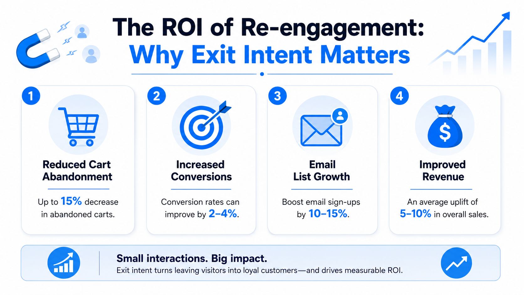
Published benchmarks show that exit-intent popups convert at an average of 3.94%, with email capture around 4.64%, while cart-abandonment exit-intent campaigns can reach 17.12%, and top A/B-tested campaigns have converted 26.83% of visitors, according to TryFlint's exit-intent popup conversion statistics roundup. The same roundup also cites an independent industry source reporting that well-executed exit-intent popups typically convert between 2% and 5%, can save up to 15% of visitors who were about to leave, and that mobile popups can still convert at 11.07%.
Why merchants still invest in it
Those numbers explain why exit intent became a standard CRO tactic instead of a gimmick. It addresses three expensive problems at once.
- Cart loss: High-intent shoppers leave all the time, often for reasons that can be addressed with better messaging or a better offer.
- Email capture: Not every visitor will buy on the first session, so recovering the relationship matters almost as much as recovering the sale.
- Late-funnel efficiency: A message shown right before exit can produce more value than a message shown early, because the visitor has already self-qualified through behavior.
There's also a practical budget argument. If you're already paying for traffic through paid social, search, influencers, or email, every abandoning visitor represents money already spent. Exit intent is often one of the lowest-friction ways to recover some of that sunk acquisition cost.
Where the economics are strongest
Not every page deserves an exit popup. The strongest economics show up when visitor intent is already high.
A homepage bounce is weaker than a cart exit. A generic collection page is weaker than a product page with active engagement. The broad average matters, but the page-level context matters more.
To quickly consider:
| Page context | Exit-intent value |
|---|---|
| Blog or content page | Strong for email capture |
| Product page | Strong for education, reassurance, or soft incentive |
| Cart page | Strongest for revenue recovery |
| Checkout-adjacent pages | Strong if the offer removes friction |
The best business case for exit intent isn't “popups work.” It's “high-intent exits are too valuable to ignore.”
For a Shopify merchant, that's usually enough justification to test it seriously. The key is not whether exit intent can work. It can. The key is whether your implementation is selective enough to protect margin and customer experience.
Practical Exit Intent Use Cases for Shopify Stores
The easiest way to waste exit intent is showing the same offer everywhere. The visitor leaving your homepage and the shopper abandoning a cart are not the same person, and they shouldn't get the same message.
What to show on each page type
On a product page, the shopper is often hesitating, not rejecting. That means educational or reassurance offers can work better than an instant discount.
A few examples:
- Out-of-stock product: Offer a back-in-stock signup instead of sending them away empty-handed.
- High-consideration product: Show a buying guide, comparison chart, or short FAQ prompt.
- Variant-heavy product: Offer help choosing size, bundle, or fit.
On a cart page, the shopper has already signaled purchase intent. For this reason, direct recovery offers are particularly appropriate.
That might be:
- Free shipping threshold messaging: If they're close, show what activates it.
- Save-your-cart capture: Ask for email or SMS so they can resume later.
- Limited coupon logic: Only if margin allows it, and only if it solves a real objection.
For merchants thinking specifically about abandoned-checkout recovery, SelfServe has a practical piece on recovering lost Shopify sales that pairs well with exit intent because it looks at the full recovery flow, not just the onsite message.
When not to lead with a discount
Discounting is easy. That doesn't make it smart.
If someone is leaving a homepage or collection page, they may not need a price cut. They may need direction. In that case, send them to bestselling collections, a quiz, a bundle page, or a category relevant to what they've browsed.
For top-of-funnel traffic, lead magnets often make more sense than coupons. If your store sells replenishable or education-heavy products, a buying guide, routine planner, starter checklist, or care guide can be a better trade than a margin hit. If you need inspiration, this roundup of lead magnet examples for ecommerce shows the kind of offer that fits earlier-stage visitors better than a last-second discount.
Another underused use case is exit feedback. If shoppers are dropping off on a key page, ask one question. What stopped you today? Keep it optional. Keep it short. That kind of popup won't recover every visit, but it can improve your store faster than another coupon test.
A practical Shopify setup often looks like this:
| Page | Better exit offer | Usually weaker option |
|---|---|---|
| Homepage | Bestsellers or quiz | Blanket discount |
| Product page | Reassurance or save for later | Immediate markdown |
| Cart page | Free shipping or cart save | Generic newsletter ask |
| Blog page | Content upgrade or email opt-in | Product discount |
That's the pattern to follow. Match the popup to the reason for the exit, not just the fact that an exit happened.
Implementing Exit Intent The Right Way
The stores that get value from exit intent usually do one thing differently. They build rules before they build designs.
A popup can look polished and still underperform if the wrong people see it. Segmentation is what turns exit intent from a blunt instrument into a recovery tool.
Segment first and design second
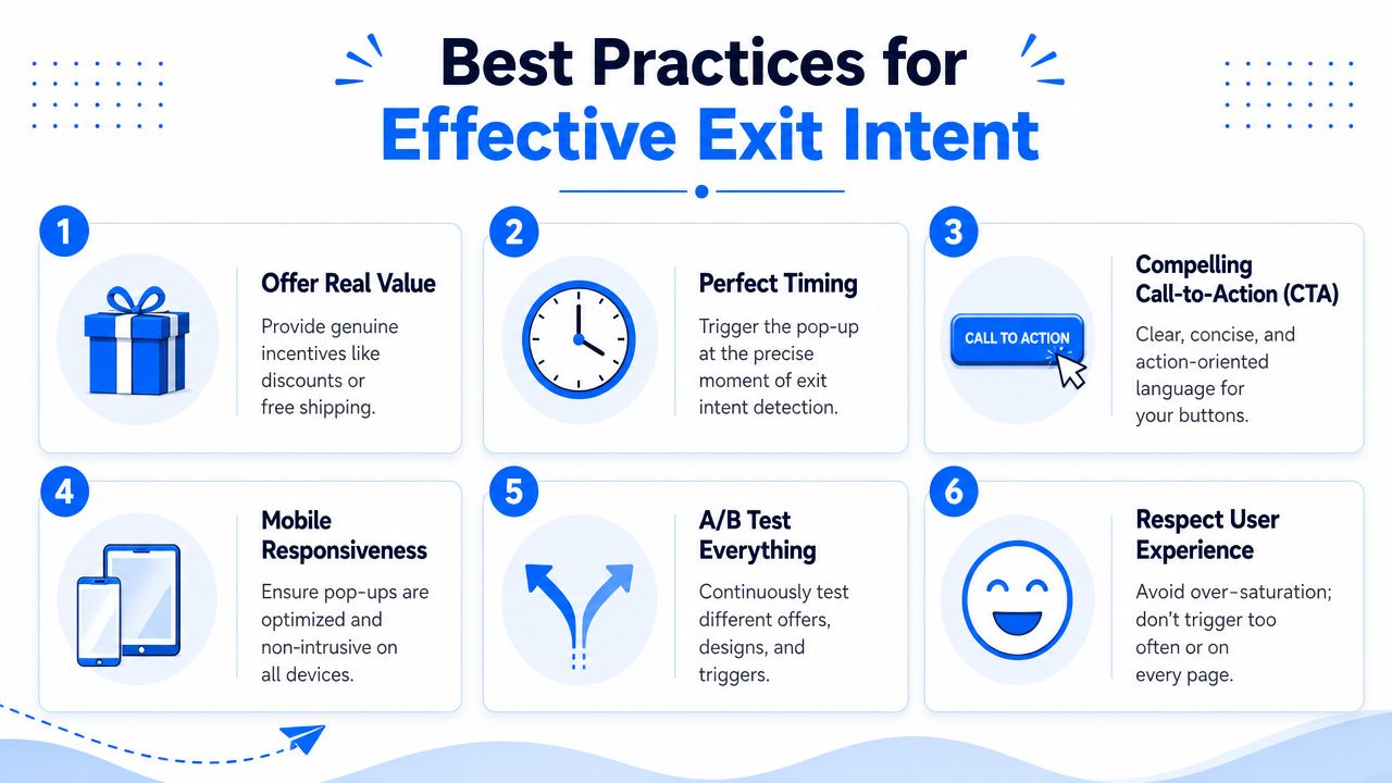
The clearest guidance from current industry coverage is that exit-intent popups work best when they're customized according to page content, user segment, traffic source, device, returning status, and cart value. The same source also notes that only a modest share of abandoning visitors is typically recovered, roughly 10% to 15%, which makes selective use more defensible than blanket deployment, as discussed in Dynamic Yield's lesson on exit intent tactics.
That should shape your setup immediately.
Start with a segmentation grid like this:
- New visitor from paid social: Offer a first-order incentive or email capture tied to the campaign promise.
- Returning visitor with viewed products: Show reassurance, saved favorites, or what's new.
- Cart abandoner with higher cart value: Test value-adds before discounts.
- Existing subscriber: Don't ask for the email again. Show cart recovery or support instead.
- Mobile shopper: Use simpler formats and tighter triggers.
A popup isn't personalized because it uses the visitor's name. It's personalized when the offer fits the page, the traffic source, and the stage of the buying journey.
If you're choosing tools, this is also where capabilities matter. Some merchants use simple modal builders. Others need more control over triggers and formats. SmashPops, for example, supports exit-intent targeting along with device, referrer, visit count, and other display rules, which is useful if you want to test gamified formats against standard recovery offers.
Here's a quick visual walkthrough before the rest of the execution details:
The parts of a popup that actually matter
Once the audience is right, the creative needs to do one job. Make the next step obvious.
Focus on these elements:
Headline clarity
Lead with the value. “Get free shipping on this order” beats vague urgency.Offer relevance
The offer should answer the likely objection. Cost, uncertainty, timing, or decision fatigue.CTA specificity
“Save my cart” is stronger than “Submit.” “Get the guide” is stronger than “Learn more.”Design restraint
Clean layout wins. One main action. Minimal fields. Fast to process.Close behavior
Don't trap people. If declining feels hostile, the brand pays for it later.
Testing without annoying your customers
A/B testing matters, but not every variable matters equally. Test the offer first. Then the headline. Then the CTA. Trigger sensitivity comes after that.
For Shopify stores, the most common execution mistakes are frequency and duplication. A visitor sees a welcome popup, then a discount bar, then an exit popup, then a spin wheel. That stack doesn't feel optimized. It feels desperate.
Use a simple testing discipline:
- One main recovery goal per page
- One popup per session for most visitors
- Suppression rules for converters and subscribers
- Separate mobile and desktop logic
If you want a practical framework for validating performance after launch, this guide on testing whether your pop-up works well on your website is useful because it pushes beyond impressions and looks at actual conversion behavior.
Advanced Strategies and Modern Challenges
The old mental model for exit intent is still stuck on desktop. Cursor moves upward, popup appears, conversion happens or doesn't. That model is incomplete now.
Why mobile exit intent is harder
A major gap in most public advice is mobile behavior. Much of the explanation still centers on mouse movement, even though mobile implementations depend on different signals such as quick upward scrolling and back-button behavior. Current coverage also notes that mobile traffic dominates many markets, yet exit intent is less straightforward on mobile than on desktop, as discussed in Kissmetrics' take on exit-intent strategies.
That changes how you should think about deployment.
On desktop, the trigger can be aggressive because the signal is relatively clean. On mobile, false positives are easier to create. A person scrolling up might be leaving, or they might be checking product details again. A back-button action might mean abandonment, or it might mean normal navigation.
For that reason, strong mobile setups usually rely on combinations of signals and simpler experiences:
- Lightweight overlays instead of giant modals
- Shorter copy with one clear action
- Device-specific suppression rules
- Page-specific triggers instead of site-wide settings
The goal on mobile isn't to copy desktop behavior. It's to create a believable recovery moment without disrupting the session.
Privacy expectations changed the standard
There's another reason blanket popup strategies are fading. Shoppers expect more relevance and less interruption.
That doesn't mean exit intent is obsolete. It means the bar is higher. If you're asking for data, offering a coupon, or interrupting a session, the value exchange needs to be obvious. If the popup feels unrelated to what the shopper is doing, it trains people to dismiss your on-site messaging altogether.
A good modern rule is to ask three questions before launching any campaign:
| Question | Why it matters |
|---|---|
| Does this fit the page intent | Irrelevant offers get ignored |
| Does this fit the device | Mobile friction is less forgiving |
| Does this fit the visitor stage | New, returning, and carted visitors need different prompts |
Generic exit popups don't fail because popups are dead. They fail because the merchant hasn't earned the interruption.
There's also a broader journey question. Sometimes the right move isn't to force one more on-site conversion. Sometimes it's to capture the relationship and continue through email, SMS, or retargeting. Exit intent works best as one layer in that system, not the whole system.
Measuring Success and Troubleshooting
Once exit intent is live, don't judge it by impressions or by whether the popup “looks good.” Judge it by whether it changes outcomes you care about.
The metrics that matter most
A useful scorecard includes four things:
- Popup conversion rate: Did the visitor take the intended action?
- Attributed email or lead capture: Did list growth improve from this entry point?
- Revenue influence: Did recovered sessions produce orders or coupon-driven sales?
- User experience signals: Are shoppers bouncing, closing instantly, or complaining?
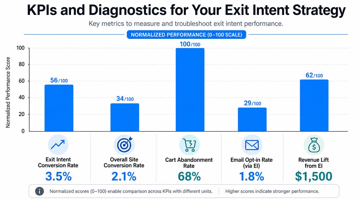
If you already track marketing KPIs across channels, the discipline is similar. This broader guide to measuring SEO success for businesses is helpful because the principle carries over well. Pick a few outcome metrics, tie them to business value, and avoid vanity reporting.
How to diagnose weak performance
Technically, exit intent is usually implemented as a lightweight JavaScript listener that watches behavioral signals and fires in milliseconds when abandonment is predicted. On desktop, strong signals include rapid cursor movement toward browser controls, with supporting cues such as scroll reversals, inactivity windows of about 10 to 30 seconds, and tab focus loss, according to Personizely's glossary entry on exit-intent technology. That matters because the trigger is probabilistic. It can misfire.
When results are weak, diagnose the issue in this order:
Trigger problem
If the popup fires too early, the detection is too sensitive or the display rules are too broad. This is common on mobile and on content-heavy pages.
Signs:
- High impressions
- Low engagement
- Fast dismissals
Fix:
- Narrow the eligible pages
- Add visitor filters
- Reduce frequency
- Tighten mobile behavior rules
Offer problem
Sometimes the trigger is right and the message is wrong. A newsletter ask on the cart page is usually weaker than a cart-specific recovery message.
Signs:
- Reasonable view rate
- Weak clickthrough or submission rate
- Better performance on one page type than another
Fix:
- Match offer to page intent
- Test value-add versus discount
- Rewrite the headline and CTA
UX problem
The popup may be technically correct and strategically relevant, but still too hard to act on.
Signs:
- Good clicks, weak completions
- Rage-closes or repeated dismissals
- Complaints from repeat visitors
Fix:
- Remove fields
- Improve mobile layout
- Make the close option clear
- Stop stacking multiple onsite messages
When an exit-intent campaign underperforms, the first question isn't “Should we redesign it?” It's “Did we show the right offer to the right visitor at the right moment?”
That mindset keeps you from solving strategy problems with cosmetics.
Frequently Asked Questions About Exit Intent
Will exit intent popups hurt SEO
Not automatically. Problems usually come from poor implementation, especially intrusive experiences that damage usability. If the popup is easy to close, loads cleanly, and doesn't block the entire mobile experience, the bigger risk is usually conversion friction, not search visibility.
Will exit intent slow down my Shopify store
It shouldn't if the tool is built well and configured carefully. Exit intent is commonly implemented through a lightweight JavaScript listener rather than a heavy on-page element that constantly interrupts the session. The bigger performance issue is usually adding too many apps, too many scripts, or too many overlapping popup systems at once.
Are exit intent popups effective on mobile
They can be, but they need a different setup. Mobile doesn't have cursor behavior, so triggers rely on things like scroll patterns, back-button behavior, and pauses in activity. That means mobile exit intent is less straightforward and needs more careful tuning.
Should every Shopify store use exit intent on every page
No. That's one of the fastest ways to turn a useful recovery tool into background noise. The strongest use cases are usually product, cart, and other high-intent pages where the visitor is close to a decision.
What's the best first campaign to test
For most Shopify stores, start with one high-intent scenario instead of a site-wide rollout. Cart recovery is usually the clearest first test. If your store has a longer buying cycle, a product-page email capture or save-for-later flow can also make sense.
If you want to turn exit intent into something more engaging than a standard modal, SmashPops gives Shopify stores a way to run gamified popups with exit-intent targeting, display rules, coupon generation, and email integrations. It's a practical option if you want to test whether an interactive format fits your store better than a basic last-chance popup.
