Usually, styling your popup is done in the “Design” section (for both game and win screens).
However, you also have the freedom to create more advanced styling using custom CSS in “Game screen > Design > General > Add custom CSS”. This CSS will be applied globally on the page the popup will be shown on, so it will be applied to any SmashPops element but also to any other element of your store, depending on the CSS selectors you choose. Let’s dive in to see the CSS selectors that we should use.
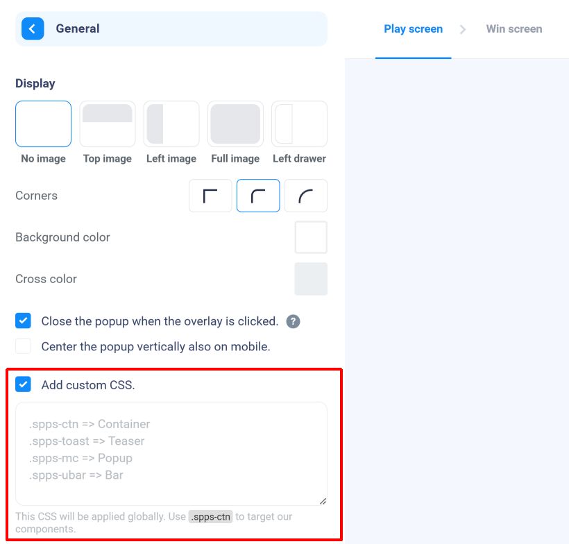
When you check “Add custom CSS”, a text field appears, where you can enter CSS that will be applied globally. Here are some useful CSS selectors that you can use to apply styles to elements :
.spps-ctn : This selects the main container (that contains the popup, the teaser and the use bar).
.spps-toast : This selects the teaser.
.spps-mc : This selects the popup.
.spps-mc .spps-cr : This selects the top right cross (to close the popup).
.spps-ubar : This selects the bar (that says “Your coupon is reserved for XX:XX”).
.spps-game-screen : This selects the game screen.
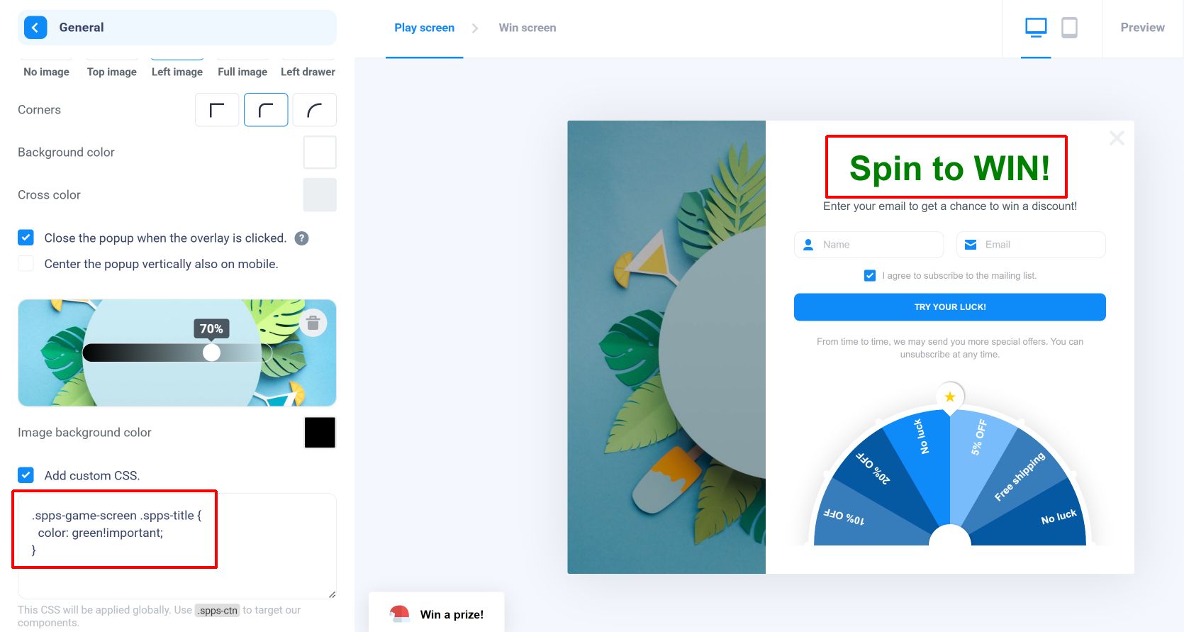
.spps-game-screen .spps-title : This selects the title of the game screen.
.spps-game-screen .spps-subtitle : This selects the subtitle of the game screen.
.spps-form : This selects the form with the email/phone/name inputs and checkboxes.
.spps-game-screen .spps-disclaimer : This selects the bottom note of the game screen.
.spps-game-screen .spps-btn : This selects the play button of the game screen.
.spps-wheel : This selects the wheel (if there is one).
.spps-win-screen : This selects the win screen.
.spps-win-screen .spps-title : This selects the title of the win screen.
.spps-win-screen .spps-label : This selects the subtitle of the win screen.
.spps-ticket-ctn : This selects the discount container of the win screen.
.spps-coupon-label : This selects the discount label of the win screen.
.spps-code : This selects the discount code of the win screen.
.spps-win-screen .spps-disclaimer : This selects the bottom note of the winscreen.
.spps-win-screen .spps-btn : This selects the continue button of the win screen.
General example
Let’s see an example where I change the font color of the game screen title:
.spps-game-screen .spps-title {
  color: green!important;
}
A few comments :
- When you write CSS, the change should be visible immediately in the builder (no need to reload or click on the “Preview” button).
- Most styles that are editable in the builder (like font size and color) are set inline. Which means that to override them, you may have to use the !important keyword (as in my example). For other styles, having enough specificity should be enough. In case you’re not familiar with this, don’t worry : if you write a rule and it doesn’t seem to be applied, you can try adding !important between the end of your value and the semicolon (this will make your CSS rule override any other directly), like this :
.spps-game-screen .spps-title {
  color: red!important;
}
Using a custom font
Unfortunately, you can’t directly upload a custom font. However, you can definitely apply a custom font if it’s hosted somewhere else (on your store or Google Fonts for instance).
If the font is already loaded on your website, you can just add the following to the custom CSS field of “Design > General” (this will override any other font family setting) :
.spps-ctn * {
  font-family: "<Name of the font>", inherit!important;
}
As the font is only loaded on the website and not on the builder, the font will only render fine on your website (you’ll see another font on the builder).
And in case the font is not loaded on your website, you can load it using CSS before using it :
@font-face {
  font-family: "<Name of the font>";
  src: url("<URL of the font>");
  font-weight: normal;
  font-style: normal;
}
.spps-ctn * {
  font-family: "<Name of the font>", inherit!important;
}
This time, the font should appear in the preview (but if it’s already loaded on your website, do not load it twice!).
Changing the popup size on desktop
The popup may be quite big on a desktop-sized browser. If you’d like to change its size, you can use the following CSS :
@media (min-width: 769px) {
  .spps-ol .spps-mc {
    transform: scale(0.8)!important;
  }
}
You can modify the “0.8” value above to any value between 0 and 1 to adjust the size on desktop.